STAR Moments

I'm in a nice local coffee shop, trying to build a presentation about EMR Usability. Christmas music is playing in the background, some of it actually unique.

I think of myself as an evangelist for EMR usability.

How can I deliver a S.T.A.R. Moment for the audience? What is a S.T.A.R. Moment? It stands for "Something They'll Always Remember".

A couple of examples from Nancy Duarte's blog.

What I want for Christmas is an inspiration.

Maybe it will be some dramatic illustration of how often doctors get interrupted, or how much time it takes to do some paltry task, or how long it takes to tell a story in a progress note. Or bringing along an old Underwood typewriter. Or a tableful of clocks or timers.

What's the message?
Usability matters. Here's what it looks like. Give me some.

A Beautiful EMR Note!

I don't get to say this often, but this is a beautiful progress note produced by a commercial EMR. Most progress notes from EMRs look like the company fired all the people who had an eye for page layout and design.

click image below to see enlarged view

Here's what I like about this note:

  • It's visually inviting, with a very clean look.
  • Effective use of font choice, bold headers, left-alignment, rules of proximity and spacing (see prior post on C.R.A.P. design principles).
  • The left hand column gets the less critical Past History details (yellow highlight added) off to the side. This allows me to know they are out of the way as I scroll, but remain available at a glance. This should be standard in all EMRs, in my opinion.
  • I can skip directly to the sections of interest (pink highlighted added) to answer the questions: "why was this patient seen, what did the consultant think, and what is the plan?"

What could be improved?

  • Move the Assessment and Plan to the top of the note. That's what almost every reader is looking for. Why not put it first? I have a few consultants who do that routinely in their dictations, and it's always a hit.
  • Enhance the Vital Signs so they are easier to read. Add bold to labels, add more space between items.
Temp 97.0, BP 154/106, HR 77, Wt 235.4 lbs
  • Lose the underlining. It would look better this way (bold, and a step bigger)

ReasonForAppt.png

Your thoughts, readers?

Making Lists of Diagnoses to Pick From

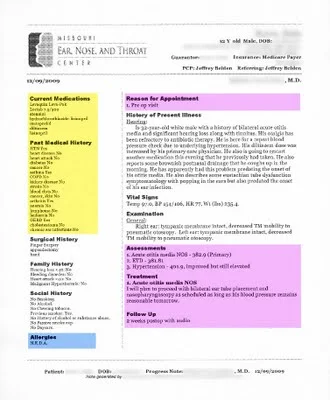
If I can't get a list with predictive search (where the search field starts guessing what I want from the few characters I've typed so far), then at least give me a heads-up list on one page. Make the list short and comprehensive enough.

I want to find about 80% of my commonly used diagnoses on one page, then multi-select all the diagnoses that I need, and then click "OK". If I can do that, I will be very happy. I've seen it done in at least one EMR.

See, I'm not hard to please.

How would you build the list?

  1. Make a fairly comprehensive list first, sorted by how often I (or family physicians in general) select that diagnosis.
  2. Then create the list on a page or two.
  3. Then add columns (to allow more items) and shrink the font until it is still readable. Test readability with a few 50-60 year old users wearing bifocals.
  4. Trim the list to one (or two, A-L and M-Z) pages.

What are the user-centered-design principles?

  1. Get it on a single visual plane in plain sight. (expand to a second page, if needed, or if users wanted it).
  2. List alphabetically. Avoid organ system grouping, which takes more cognitive effort and more visual scanning time.
  3. Use simple, frequently-used-by-clinician word choice (e.g. “headache” instead of “cephalgia”).
  4. Put most relevant words first (e.g. “diabetes mellitus, type 2”, not “type 2 diabetes”)
  5. Make font big enough to read.
  6. Eliminate words that don’t add benefit for user (e.g. for “250.41 Diabetes 1 w/ renal changes”, do include “w/ renal changes”. For “250.00 Diabetes 2 uncomplicated”, I’d argue that the “uncomplicated” is optional, and takes up space).

The single page has some advantages over the predictive search, which can only do one diagnosis at a time.

  • I don't have to use the keyboard.
  • I can select 6 diagnoses with only 6 clicks.
  • I press OK once, and not 6 times.
  • I can go a lot faster.
  • I'll develop muscle memory finding the commonly picked items on the page (could pick them blindfolded!).

Go ahead. Make my day.

New AHRQ-Funded Reports on Usability of EMRs

I'm excited!

I just browsed two new reports on EMR (EHR) Usability funded through AHRQ. They outline some high-priority research agenda and public policy items, and acknowledge the dearth of systematic evidence on EMR usability.

New AHRQ-Funded Reports on the Usability of Electronic Health Record (EHR) SystemsTo explore the opportunity to improve EHR system usability, AHRQ commissioned the creation of two reports that synthesize the existing research and evidence in this area and suggest common methods to evaluate EHR usability going forward.

What EMR functions would be great on a smartphone?

Answer:

Not everything.

The form factor of an iPhone is great for portability, handling messages, and doing lists.

It is not great for viewing a half-dozen tables on a single dashboard screen, or viewing a grid of 6x12 (like a medication list for many of my patients with chronic disease).

Here is a little wireframe (made very quickly with BalsamiqMockup) that offers my preliminary thoughts.

I doubt that I'd want to document a visit that had a complicated story using the iPhone. Too much keyboard work.

I could document a simple sinus infection or UTI, assuming I could do it in 6-clicks, my de facto standard for documenting an acute illness.

What would a surgeon want? On rounds, a smart phone would be convenient for:

  • automatically receiving key lab results
  • looking up today's vitals, labs, and I&O
  • viewing the OR schedule
  • viewing a clinic schedule
  • signing dictated documents
  • viewing imaging reports

It won't be too long till many EMRs have "an app for that".