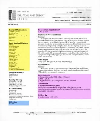
I don't get to say this often, but this is a beautiful progress note produced by a commercial EMR. Most progress notes from EMRs look like the company fired all the people who had an eye for page layout and design.
click image below to see enlarged view
Here's what I like about this note:
- It's visually inviting, with a very clean look.
- Effective use of font choice, bold headers, left-alignment, rules of proximity and spacing (see prior post on C.R.A.P. design principles).
- The left hand column gets the less critical Past History details (yellow highlight added) off to the side. This allows me to know they are out of the way as I scroll, but remain available at a glance. This should be standard in all EMRs, in my opinion.
- I can skip directly to the sections of interest (pink highlighted added) to answer the questions: "why was this patient seen, what did the consultant think, and what is the plan?"
What could be improved?
- Move the Assessment and Plan to the top of the note. That's what almost every reader is looking for. Why not put it first? I have a few consultants who do that routinely in their dictations, and it's always a hit.
- Enhance the Vital Signs so they are easier to read. Add bold to labels, add more space between items.
Temp 97.0, BP 154/106, HR 77, Wt 235.4 lbs
- Lose the underlining. It would look better this way (bold, and a step bigger)
Your thoughts, readers?

