Principles Of Effective Design - C.R.A.P.

Most EMRs don't have good visual design. Graphic artists, layout editors, and other visual communicators get taught the basic principles of visual design early in their careers. Most software engineers and managers may never get taught them. Here is a really terse presentation of 4 basic design principles that should go into every page design in an application.

The principles are: C.R.A.P.

  • Contrast
  • Repetition
  • Alignment
  • Proximity

One of my favorite Macintosh authors, Robin Williams, articulates these more fully in her book, Non-Designer's Design Book.

Check out this SlideShare Presentation to see good visual examples:

Testing & Rating EMR Usability

I just finished writing a white paper for HIMSS titled "Defining and Testing EMR Usability: Principles and Proposed Methods of EMR Usability Evaluation and Rating". It's publicly available at this link.

It has been a great team to work with. Many thanks to my Human-Computer Interaction co-authors, Rebecca Grayson and Janey Barnes. They brought experience with clinical systems and their body of user-centered design knowledge to the task. Thanks also to the team leaders Penn White MD and Tiana Thomas for harnessing the power of a cadre of volunteer contributors to the effort.

Briefly, this paper describes how poor EMR usability has hindered user adoption among physicians and hospitals. We describe a number of usability principles that apply to EMRs in particular, and then offer evaluation and testing methods for finished EMR products, and suggest ways to rate the EMRs.

Our hope is that certifying and rating organizations such as Certification Commission for Healthcare Information Technology (CCHIT) or the American Academy of Family Physicians (AAFP) will be able to use this work in developing their own rating methods that can help EMR purchasers.

Don't Make Me Think

I love this line.

It's the title of one of my favorite books on software usability, written by Steve Krug.

The human-computer interaction pros refer to this principle as "reducing cognitive load." Don't waste precious brain resources on stuff the application should be able to do quickly, accurately, and invisibly.

Here's a prime example.

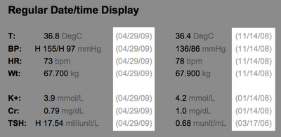
In displaying lab results, why not do the math for the clinician user? Don't make me calculate how long ago the last lab result was obtained. Tell me it was about 2 weeks ago. The precision can get more relaxed the longer ago the result was obtained.

The same principle applies to displaying the patient's age. Don't just show me the date of birth. Do the math for me.

I have plenty of more important things to think about.

EHR's should help clinician users manage the whirlwind of Childhood Immunizations

As a family physician for about 30 years now, and former “Immunization Czar” in my private practice, I lament the current state of Childhood Immunizations.

Why?

I lament the simple olden days, when a few immunizations existed, and new ones came along rarely.

I could memorize the list, and provide advice and prevention efficiently.

For simplicity, I will only refer to childhood immunizations here. Adult immunizations have some unique features.

Progress brought complexity.

New vaccines came along every year. The guidelines changed every year, in stages (ACIP recommended; then later all the authorities approved; then insurance payors reimbursed; and finally states mandated). I had new memorization to learn every year. Sometimes, I had blowback: a vaccine was not yet covered by insurance, or it was in short supply, or it required a new refrigerator for which we had neither space nor funding.

Now, it’s even more complex:

  1. We have rolling shortages, which might be national or local.
  2. We have combination vaccines, in overlapping, but not identical patterns.
  3. A particular single component vaccine might be available from two different manufacturers, but have different admin schedules (3 doses for one, but 4 doses for the other).
  4. Government-sponsored programs might require special ordering and tracking. The government choice of vaccines might differ from my organizations prior choices.
  5. Consumers are demanding customizations (break up my MMR into the 3 separate components) that fragment and complicate matters even further. This item alone could have me ranting for pages. I won’t rant, for now.
  6. The CDC schedule is offered as a range of choices, adding complexity at most well child visits. I order as individual vaccine components (MMR, or Tdap, or HiB/HepB). The nurse draws up the vaccine from a bottle marked with a brand name. He or she might have to adjust for temporary shortages, using Pediarix one week, and something else next week, depending on local supplies.

How can a human brain handle all this?
Not very well.

How can this be safe?
I think it is not.

How can this be made more efficient?
Our software could do this, but the design requirements are challenging.

Ideally, the decision support would be embedded in our EHRs.

The vaccine requirement/availability database that is used by our EHR would be maintained nationally, by the CDC, or by another entity along the lines of Multum (which maintains prescription drug databases).

The availability database could be modified locally, to reflect institutional formulary choices, or pharmacy shortages.

The decision support would examine a patient’s age, previous immunizations, and recommend a preferred dose for today (and acceptable alternatives).

The EHR database would communicate with regional or national immunization registries. That way, patients who move, or who must change providers, or who use multiple providers (the ED, the primary care physician, the developmental pediatrician, the pulmonologist) would have their immunization progress schedule available to all the providers.

Dear reader, do you know of an application or institution doing it well?

Jeff Belden MD

beldenj@health.missouri.edu

How should drug interaction warning screens look?

Most clinicians I know suffer from "alert fatigue". I don't mean they feel tired from too much caffeine.

I mean, they are tired of EHR software crying wolf with too many drug interaction warnings. Embattled users simply dismiss all drug interaction warnings without reading them. Mild or theoretical interactions should be suppressable by individual user preference, as a default setting.

This is a significant patient safety issue.

If I am relying on my software to warn me about serious drug interactions, then the warnings about milder or dubious interactions are annoying, distracting false alarms. I need to be aware of serious interactions, so I can adjust therapy.

Here's another problem: I get warned that drug A interacts with drug B. I dismiss the warning. Then I immediately get warned that drug B interacts with drug A. I know that!

Worse yet, if I then change the dose of drug A, I get warned all over again. We need smarter systems now, geared to what fallable, imperfect, tired human users need, and geared to keeping patients safe.

Here is a modest proposal of a way to display drug interactions.

Drug-Drug_interaction_alert_sketch.jpg

Note that the key findings are in the middle, the drug names are prominent, the severity level is great big number, and user pref settings are right there.

Posted by Picasa

Using tiny graphics to show a year's worth of medication history

Here are two views of the medication list.

The top view has more details, needed when the clinician is doing refills or dosage adjustments.

The bottom view is more terse, suitable for a dashboard view. The dashboard view would commonly include the problem list, allergies, vital signs, lab, and health maintenance information.

If I have a list of medications to look at, how can I quickly see the temporal dose trend without drilling into the EMR? How can we keep the history information on one visual surface?

Here's an idea below.
I have not seen it implemented in any EMR yet. Have you?

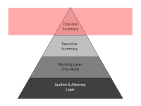
The Four-Layer EMR

We are being freed from the document-centric mental model of the medical record. In the paper past, we only could create, save, read, and review paper documents. That has changed, but our way of thinking has not.

As with data tables that allow us to sort, or links that allow us to drill down, our clinical documents have interactive features. Or should have.

So let me propose a model for the Four-Layer EMR. It would use some kind of "hide/reveal" technology. Show me the level of detail I, the reader, need right now, in this context.

The top layer I call the "one-line summary". What few words characterize this encounter. I am thinking of ambulatory physician visits. Perhaps other readers can translate this into other kinds of clinical encounters.

The one-line summary would be a terse description like: "diabetes, A1C 8.2, start metformin 500 BID" or "acute sinusitis > amoxicillin 875 BID 7 days" or "well woman exam > Gardisil, Yasmin".

The benefit? I can look at a list of all the visits chronologically and see what happened.

Like this:

Brenda Star          Acct No: 309144869
02/11/07                acute sinusitis > amoxicillin 875 BID 7 days
04/29/07              well woman exam > Gardisil, Yasmin
09/02/07              diabetes, A1C 8.2, start metformin 500 BID

The next layer down, the "Executive Summary", is what I would communicate to a surgery consultant. It is a 3-4 sentence description of this encounter in a depth adequate for a consultant or other peer not needing a complete picture of this patient.

For example, it might say "57 year old type 2 diabetic recently started on metformin with good control, needing evaluation of chronic cough, not on an ACE inhibitor".

Next, the 3rd layer, the "Working Layer" is the layer clinicians would like to work in for the details they need. That is, before we started documenting to cover our assess.

It would include only the pertinent history elements necessary to understand the diagnosis and treatment. In the Review of Systems, it would only include the positive elements, with a few negatives (e.g. "no murmur" if that is pertinent to note).

In the Assessment and Plan, only the parts that are not assumed. I do need to know which antibiotic was used. I don't need to read that the patient was told to take tylenol and come back if they don't get better as expected.

The fourth layer would make my attorney, my risk-manager, and my chart reviewers happy. All the wealth of detail is there that would only annoy the rest of us. All the detail that makes my record look more like a contract, and less like a story about a person.

Parenthetically, there are layers deeper than these four. These layers include the security/audit trails that record who recorded what and when. We'll ignore them for our purposes here.

So, how do we bring this concept about?

  1. Identify the elements that define each layer.
  2. Choose a technology that supports it in your particular product.
  3. Work out the details that specify the contents of each layer within a specific document. Could the software identify key words for Layer 1 (One-line summary) in context? Would the provider need to supply these in the beginning or end of document production?

Your thoughts?

If God wanted us to type, She wouldn’t have given us transcription

Dictating is just faster than typing! Period!

If EMRs are to successfully roll out to all physicians, physician information entry has to be faster than dictating. Only the technologically eager (like me) or the coerced (like my partners who bought the product) will spend more time doing medical record-keeping than they did before EMR implementation. Those physicians who have a choice will still dictate.

Of course, medication and diagnosis lists are the exception, once they are established. But these elements can arguably be quite time-consuming.

Wise EMR products put a little "dictate here" icon at various points in the EMR to capture a voice file, for those times when a story must be told.