How do we balance thoroughness and conciseness when displaying lab results? Some clinicians prefer viewing the selected results most likely to be actionable. Some prefer to see all results all the time. Are there approaches that meet both needs? Let’s try to display all abnormal results concisely while revealing that other results are in the normal range without necessarily showing the numbers in a tabular field.
Win-Loss graphs show deviation from expected range
We can represent all elements of a CMP (comprehensive metabolic panel) in a bar graph called a win-loss graph. Upward bars for win-loss graphs in a sports setting typically represent a win, while downward bars represent a loss. In our clinical setting, we let upward bars represent abnormal high values while downward bars abnormal low values. Critical values can be rendered with more intense color or longer bars, or both.
BMP (basic metabolic panel)
Here’s a win-loss graph for a normal BMP result. The individual test names are shown. The vertical dividers separate the functional elements of the graph sections: electrolytes | renal function | other.

Normal BMP win-loss graph
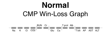
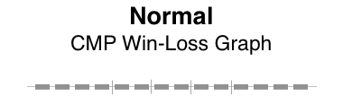
CMP (comprehensive metabolic panel)
Here are win-loss graphs for a CMP with and without the labels for individual test names. The functional elements can be described as: electrolytes | renal function | other | proteins | liver function.
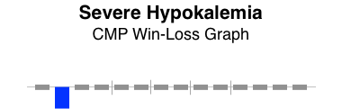
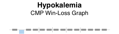
Patterns of abnormality
Patterns often reveal clues to disease. Here, the graphical patterns reveal abnormality without displaying discrete numeric results. This is of most benefit when the results are normal, the trends of change are not significant, and the numeric details are readily available with low effort.
Here are a few examples.


The win-loss graph does not display time trends well, but does give a “sparkline” (word-sized graphic) snapshot of a lab panel at a single point in time. There will be some learning involved to recall the location of each individual test, but the vertical separators make that easier. Alternatively, displaying the lab test names takes up very little additional space.
When designing dashboard displays of various clinical parameters for a single encounter (clinic visit or daily hospital visit), the win-loss graph can concisely display that abnormal values in a lab panel (such as BMP, CMP, or CBC) exist, while confirming the normality of all the other individual elements of the lab panel.