EMRs are complex applications.
No Joke.
Here's an example of a fairly typical User Preference Setting dialogs (with my annotations):
It's not always easy to find my way to the preference settings. They might be buried deep in a menu as "Options" or "Settings" or "Preferences". When I look at the options to check, it might be quite hard to understand what will happen if I check or uncheck an option.
Trainers and support staff have nightmares as a result of the complexity.
Offer users more flexibility and the troubleshooting is more complicated, but if users' initial settings are not "just right", then the application won't behave as expected.
How can we empower the physician or nurse user?
How can the preference settings be made more understandable and accessible?
How can we help users have an experience that is "right for them"?
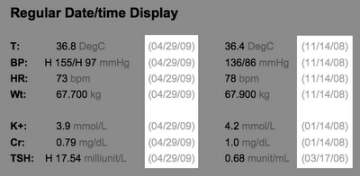
One way would be to place the preference settings closer to where they have an effect (see mock-up image below).
- Make the range of choices smaller (The Simplicity Principle of Usability).
- Make the range of choices "safer" (The Forgiveness Principle of Usability). Don't let me change things I might regret, and be unable to fix. Offer "personalization within guardrails".
- Put the choices close to the action ("Preservation of Context" and "Efficient Interactions" Principles of Usability).
I like to call this "just-in-time personalization".
The little "gears" icon shows up whenever there a few user preference (or "personalization") settings.


