visualization

Can't you just include a picture of my pill?

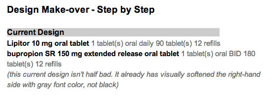
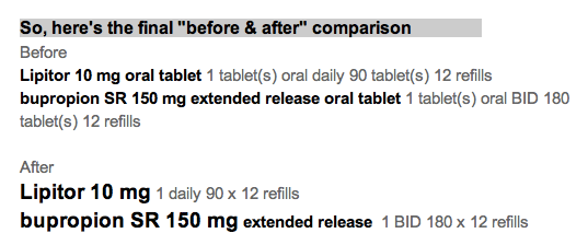
I've been involved in numerous conversations about medication lists that our healthcare organizations give to patients, and meaningful use rules require the lists. I used to think it was a hopeless cause to get the picture of the pill your pharmacist gave you at your last refill into your personal medication list.

I am not so hopeless, but I remain sanguine. The incentives aren't aligned yet among all the stakeholders. The data doesn't flow freely. It's a rare patient that would use their smartphone to photograph their pills (good lighting and backgrounds are hard!) to include them in their Personal Health Record (PHR), if they are one of the rare people who maintain a PHR.

So, to give you a taste of the challenges, here is a short video showing the different colors and shapes of one single generically available pill: lisinopril. I captured it from ePocrates, which is a wonderful tool for providers.


If it's a brand name drug (for example, Crestor), getting a picture is far easier.


There is a code called the NDC code that tells the pharmacist which exact generic version of your lisinopril you are taking, but your doctor doesn't know (or care, generally) which NDC code is your particular lisinopril. But as we (patients, nurses, doctors, and pharmacists) start coming to expect the pill pictures as part of our conversations, then the NDC code sharing will become more important.

It's in our future, but not our present.

Why dashboards?

Dashboard views should be the rule rather than the exception in EHR design
Physicians and nurses have to deal with complex data involving a number of realms, making quick judgments based on the overview of the patient's story.


Dashboards beat nested navigation in several ways:
  1. They minimize navigation.
  2. They reduce cognitive load by presenting the needed information in a single view. 
    1. Users don't have to think "What next? Where next? 
    2. Users don't have to use visual memory to recall the last page view: "What was that potassium value I saw seconds ago? Was that drug dose once a day or twice day?"
    3. Users can "scan the scene" to quickly see if there are any abnormals. If the view is "clean", then we can move on.
  3. They accommodate a variety of workflow styles. Methodical  or meandering paths work equally well when only the eye (and not the finger) does the walking. ABCDE sequence is as easy as AEDCB.
  4. They can be customized or personalized to meet unique user needs.
There are some caveats.
  1. Provide only the information needed for the tasks at hand. No more, and no less. That may mean leaving out detail from the grand view, while making that detail available when drilling down.
  2. Use visual cues. They don't have to be words. They do need to be recognizable at a glance. Think icons and traffic lights. 
  3. Try the designs out on real world users.

Medications List - Visual Design Make-over

Attribution

Some rights reserved by CarbonNYC

I'm reading "Designing with the Mind in Mind: Simple Guide to Understanding User Interface Design Rules" by Jeff Johnson. As a typography/layout and design geek, some things are obvious to me, but Jeff Johnson reminds me they are not obvious to everyone. He even makes explicit the cognitive psychology behind the "design rules" that have been gospel to designers.

I'll give his teaching a test drive here, starting with a design from a typical EHR.

Design Make-over - Step by Step

EHR Usability: An Illustrated Guide

I did a brief presentation at NIST on July13, along with about 2 dozen other usability geeks like me. The government recognizes the importance of having usable software if physicians and hospitals are to be expected to adopt electronic medical records. The ARRA incentives alone won't be sufficient if the software usability is lacking, causing physicians and other healthcare workers to lose productivity. They might break even, but many physicians worry that they won't, even with the financial incentives. Here are the pictures. You have to imagine my voice.

View more presentations from Jeff Belden MD.

NIST will be posting the slides and audio later. You might try here.

Refill alerts on a medication list - help reduce unnecessary work

What if the doctor and patient took care of all the necessary work at a visit for managing chronic disease?

Disclosure: I hate getting calls and faxes for refill requests. It seems totally avoidable. I’m not winning this battle.

It’s fairly common for primary care physician offices to get dozens of phone calls or faxes a week about medication refills.

    It might be about a patient I just saw last week.
  • These calls take time and money: mine and the staff.
  • This is unreimbursed work.
  • I get whiney about it.

If there is a discrepancy between the pharmacy (or patient) request and my records, it gets a lot worse.

Then calls go back and forth, trying to reconcile the difference, and the outcome is not always satisfactory.

So, what can we do about it?

How about adding a little alert to the medication list?

  • Don’t make me think (that is, don’t make me “sort by last refill date”, figure out the interval since last refill, count the meds and remember their names), just show me!
  • Dark red (or gray) could mean “due for refill in <3 months”.
  • Pink (or lighter gray) could mean “due for refill in <6 months”.
  • These intervals (3 and 6 months) match the numbers for “frequency of diabetic lab tests” and “limit on controlled substance refills”.

With this information right in my face, it would be easy to see if, and which, medications need to be refilled today. That avoids an extra call for the patient, an extra fax/call or two for my staff, and a headache for me.

That makes me happy!

(special thanks for the idea to Phil Vinyard at University Physicians Family Medicine Clinics)

A Beautiful EMR Note!

I don't get to say this often, but this is a beautiful progress note produced by a commercial EMR. Most progress notes from EMRs look like the company fired all the people who had an eye for page layout and design.

click image below to see enlarged view

Here's what I like about this note:

  • It's visually inviting, with a very clean look.
  • Effective use of font choice, bold headers, left-alignment, rules of proximity and spacing (see prior post on C.R.A.P. design principles).
  • The left hand column gets the less critical Past History details (yellow highlight added) off to the side. This allows me to know they are out of the way as I scroll, but remain available at a glance. This should be standard in all EMRs, in my opinion.
  • I can skip directly to the sections of interest (pink highlighted added) to answer the questions: "why was this patient seen, what did the consultant think, and what is the plan?"

What could be improved?

  • Move the Assessment and Plan to the top of the note. That's what almost every reader is looking for. Why not put it first? I have a few consultants who do that routinely in their dictations, and it's always a hit.
  • Enhance the Vital Signs so they are easier to read. Add bold to labels, add more space between items.
Temp 97.0, BP 154/106, HR 77, Wt 235.4 lbs
  • Lose the underlining. It would look better this way (bold, and a step bigger)

ReasonForAppt.png

Your thoughts, readers?

Don't Make Me Think

I love this line.

It's the title of one of my favorite books on software usability, written by Steve Krug.

The human-computer interaction pros refer to this principle as "reducing cognitive load." Don't waste precious brain resources on stuff the application should be able to do quickly, accurately, and invisibly.

Here's a prime example.

In displaying lab results, why not do the math for the clinician user? Don't make me calculate how long ago the last lab result was obtained. Tell me it was about 2 weeks ago. The precision can get more relaxed the longer ago the result was obtained.

The same principle applies to displaying the patient's age. Don't just show me the date of birth. Do the math for me.

I have plenty of more important things to think about.