Medications List - Visual Design Make-over

Attribution

Some rights reserved by CarbonNYC

I'm reading "Designing with the Mind in Mind: Simple Guide to Understanding User Interface Design Rules" by Jeff Johnson. As a typography/layout and design geek, some things are obvious to me, but Jeff Johnson reminds me they are not obvious to everyone. He even makes explicit the cognitive psychology behind the "design rules" that have been gospel to designers.

I'll give his teaching a test drive here, starting with a design from a typical EHR.

Design Make-over - Step by Step

iPhone accessibility feature: Bluetooth Braille reader

Thanks to David Baquis, accessibility Specialist for the US Access Board, who spoke at yesterday's Health IT Usabilty Workshop sponsored by the ONCHIT, NIST, and AHRQ. He opened my eyes to my blind spot for those with disabilities trying to use health IT products.

I found myself wondering if the iPhone had accessibility features. I vaguely recalled that it had Voice Over technology that would read the screen.

I just saw this tweet about a Bluetooth Braille screen reader that works with iPhone. Here's the YouTube video.

EHR Usability: An Illustrated Guide

I did a brief presentation at NIST on July13, along with about 2 dozen other usability geeks like me. The government recognizes the importance of having usable software if physicians and hospitals are to be expected to adopt electronic medical records. The ARRA incentives alone won't be sufficient if the software usability is lacking, causing physicians and other healthcare workers to lose productivity. They might break even, but many physicians worry that they won't, even with the financial incentives. Here are the pictures. You have to imagine my voice.

View more presentations from Jeff Belden MD.

NIST will be posting the slides and audio later. You might try here.

AHRQ publishes paper - "EHR Usability: Vendor Practices & Perspectives"

AHRQ just published a new white paper last week.
You can read it here as a PDF.

From World Usability Day 2006 poster
The objectives of the project that led to this paper were:

...to understand processes and practices by these vendors with regard to:
  • The existence and use of standards and “best practices” in designing, developing, and deploying products.
  • Testing and evaluating usability throughout the product life cycle.
  • Supporting post-deployment monitoring to ensure patient safety and effective use.
It's good to see continued attention to usability in the EHR/EMR world.

No Errors from Tall Men

I recently learned about Tall Man lettering.

acetAZOLAMIDE.png

Not to be confused with Mad Men

MadMEN.png

I had been annoyed by the ugliness (the typography snob inside) of drug names like acetAZOLAMIDE instead of acetazolamide. Now I know why the words benefit from being homely.

  • Aiming for patient safety.
  • Helps distinguish drugs that otherwise have similar-looking names.
    • acetAMINPHEN
    • acetAZOLAMIDE

http://www.fda.gov/cder/drug/MedErrors/nameDiff.htmTall Man Lettering of Drugs

Refill alerts on a medication list - help reduce unnecessary work

What if the doctor and patient took care of all the necessary work at a visit for managing chronic disease?

Disclosure: I hate getting calls and faxes for refill requests. It seems totally avoidable. I’m not winning this battle.

It’s fairly common for primary care physician offices to get dozens of phone calls or faxes a week about medication refills.

    It might be about a patient I just saw last week.
  • These calls take time and money: mine and the staff.
  • This is unreimbursed work.
  • I get whiney about it.

If there is a discrepancy between the pharmacy (or patient) request and my records, it gets a lot worse.

Then calls go back and forth, trying to reconcile the difference, and the outcome is not always satisfactory.

So, what can we do about it?

How about adding a little alert to the medication list?

  • Don’t make me think (that is, don’t make me “sort by last refill date”, figure out the interval since last refill, count the meds and remember their names), just show me!
  • Dark red (or gray) could mean “due for refill in <3 months”.
  • Pink (or lighter gray) could mean “due for refill in <6 months”.
  • These intervals (3 and 6 months) match the numbers for “frequency of diabetic lab tests” and “limit on controlled substance refills”.

With this information right in my face, it would be easy to see if, and which, medications need to be refilled today. That avoids an extra call for the patient, an extra fax/call or two for my staff, and a headache for me.

That makes me happy!

(special thanks for the idea to Phil Vinyard at University Physicians Family Medicine Clinics)

Personalizing User Preferences, within Guardrails

EMRs are complex applications.

No Joke.

Here's an example of a fairly typical User Preference Setting dialogs (with my annotations):

It's not always easy to find my way to the preference settings. They might be buried deep in a menu as "Options" or "Settings" or "Preferences". When I look at the options to check, it might be quite hard to understand what will happen if I check or uncheck an option.

Trainers and support staff have nightmares as a result of the complexity.

Offer users more flexibility and the troubleshooting is more complicated, but if users' initial settings are not "just right", then the application won't behave as expected.

How can we empower the physician or nurse user?

How can the preference settings be made more understandable and accessible?

How can we help users have an experience that is "right for them"?

One way would be to place the preference settings closer to where they have an effect (see mock-up image below).

  • Make the range of choices smaller (The Simplicity Principle of Usability). 
  • Make the range of choices "safer" (The Forgiveness Principle of Usability). Don't let me change things I might regret, and be unable to fix. Offer "personalization within guardrails".
  • Put the choices close to the action ("Preservation of Context" and "Efficient Interactions" Principles of Usability).

I like to call this "just-in-time personalization".

The little "gears" icon  shows up whenever there a few user preference (or "personalization") settings.

Design Thinking

I've just started reading Tim Brown's book, "Change by Design: How Design Thinking Transforms Organizations and Inspires Innovation". It quickly had me thinking about innovations in EMR usability.

Design Thinking balances three values:

Desirability, Viability, and Feasibility.

IDEO_DesirabilityViabilityFeasibility.png

[Tim Brown's illustration]

He describes desirability as meeting true human needs and desires, as opposed to the drummed up desires personified in perfume ads. On a global scale, these needs include clean water, adequate diet, good health, education for children, and a safe community.

What does "desirability" mean for EMR users?

Here are a few of my ideas. What ideas can you add?

Basic Needs & Desires for Physician and Nurse EMR Users

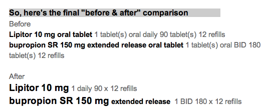
Rapid, easy, intuitive documentation

  • We shouldn't have to type so much. Voice recognition is nearly there, but not mainstream. Voice capture for transcription embedded into the EMR is spotty.
  • How about features like "auto-fill" used in e-commerce sites?
  • How about "predictive fill" as we see now in Google's predictive search phrases as we start to type?

Smart displays of key information for the task at hand

  • The information ought to be visible at a glance.
  • No navigation should be needed.
  • All the cognitive effort should be squeezed out of the information. Don't make me do mental math. Don't make me remember a rule, or a set of normal ranges. Leave my brain to do only the work that the computer cannot do for me.

Foster collaborative decision-making with patients and their families

  • In the hospital, acute pain med doses are often negotiated ("That medicine made me nauseated last time. Can I have something else for pain?" or "Can I have a smaller dose, so I'm not so drowsy?") Give the nurse and patient the tools to decide together.
  • In ambulatory care, physicians often explain and negotiate items like bone density scans or PSA blood tests. The guidelines recommend counseling for edge cases, like the most recent guidelines from the USPSTF for mammography for women age 40-49. Give physicians counseling tools that help patients (and doctors, for that matter) understand comparative risks. We do a poor job of that currently.

Enable user-level configurability

  • Novices have different needs from more experienced clinicians.
  • User preferences change over time. We learn. Make it easy to find and change preferences. Currently, these prefs are buried deep and are widely scattered.

How will these changes happen?