View more presentations from Jeff Belden MD.
NIST will be posting the slides and audio later. You might try here.
Family physician & usability evangelist Jeff Belden MD
writes about EHR usability & data visualization at the point of care.
View more presentations from Jeff Belden MD.
NIST will be posting the slides and audio later. You might try here.
What if the doctor and patient took care of all the necessary work at a visit for managing chronic disease?
Disclosure: I hate getting calls and faxes for refill requests. It seems totally avoidable. I’m not winning this battle.
It’s fairly common for primary care physician offices to get dozens of phone calls or faxes a week about medication refills.
If there is a discrepancy between the pharmacy (or patient) request and my records, it gets a lot worse.
Then calls go back and forth, trying to reconcile the difference, and the outcome is not always satisfactory.
So, what can we do about it?
How about adding a little alert to the medication list?

With this information right in my face, it would be easy to see if, and which, medications need to be refilled today. That avoids an extra call for the patient, an extra fax/call or two for my staff, and a headache for me.
That makes me happy!
(special thanks for the idea to Phil Vinyard at University Physicians Family Medicine Clinics)
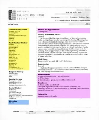
I don't get to say this often, but this is a beautiful progress note produced by a commercial EMR. Most progress notes from EMRs look like the company fired all the people who had an eye for page layout and design.
click image below to see enlarged view

Here's what I like about this note:
What could be improved?
Temp 97.0, BP 154/106, HR 77, Wt 235.4 lbs

Your thoughts, readers?
I love this line.
It's the title of one of my favorite books on software usability, written by Steve Krug.
The human-computer interaction pros refer to this principle as "reducing cognitive load." Don't waste precious brain resources on stuff the application should be able to do quickly, accurately, and invisibly.
Here's a prime example.
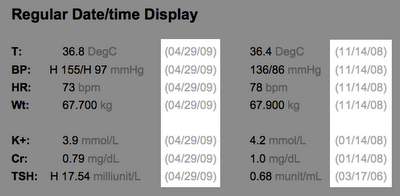
In displaying lab results, why not do the math for the clinician user? Don't make me calculate how long ago the last lab result was obtained. Tell me it was about 2 weeks ago. The precision can get more relaxed the longer ago the result was obtained.


The same principle applies to displaying the patient's age. Don't just show me the date of birth. Do the math for me.
I have plenty of more important things to think about.