
Sparklines are data-intense, word-sized graphics designed to be incorporated into text. Used in an EMR, we can see the recent lab value and its associated trend over time.
Edward Tufte pioneered the concept of sparklines, and his website has a large collection of resources to those who want to explore sparklines further.
We should be using sparklines throughout our EMRs.
- As elements of clinical dashboards
- Monitoring chronic disease processes (lipids, A1C, renal function for diabetes)
- Monitoring vital sign and physiologic parameters in ICU patients
- Managing improvement trends in CQI processes
- Tracking financial performance in management dashboards
Where can I find code to implement sparklines?
Visit this site for links to non-commercial in several programming environments, including PHP, Javascript, C#, Lisp, Perl, Python, Ruby, Java, Excel VBA.
Commercial Implementations of sparklines include software add-ons for Excel:
BissantzSparkMaker
MicroCharts
Business Refinery SimpleCharts
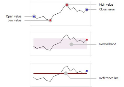
This graphic from MicroCharts gives detail on how we can show "normal range" or "target range" with a gray band, or a threshold value with a red line.
Developers! Start your engines!
Clinicians! All you need is pencil and paper to start sketching the dashboards, lab displays, and other graphs you need. Then share those with your EMR vendor.
Let's start seeing these word-sized, data intense graphics in all our EMR visual displays.