We just published our research testing whether a new dynamic physician note design would be better (faster to read, able to find correct information more often) than today's typical EHR note. The new designs had advantages.
You can read the article here:
Dynamic Electronic Health Record Note Prototype: Seeing More by Showing Less
Assessment and Plan to the top
Figure 1.
Four model notes were compared. A is the traditional SOAP note. B, C, and D move Assessment & Plan to the top. The second column demotes some content's visual importance.
The easiest change to make (B, C, and D above) is putting "Assessment and Plan" at the top of the note. That's where readers go the vast majority of the time. Other parts of the note are used less often, and then mostly to find a specific detail. Making this change is technically easy. Readers understand it. It makes writing a note no more difficult than it is now.
Two-column note sweeps pesky old details to the side
A second improvement is also fairly easy to make (B and D), and has been implemented in a number of EHR platforms already. I posted about this years ago (A Beautiful EMR Note!) when I first saw such a note from eClinical Works. This moves the "lists and the past" to one side in a smaller subsidiary column. The main story (Present Illness, Exam, and Assessment and Plan) all stay in the wider main column. The reader finds relevant details faster because the more stable background details are swept to the side. This reduces visual clutter and information overload.
Seeing more by showing less
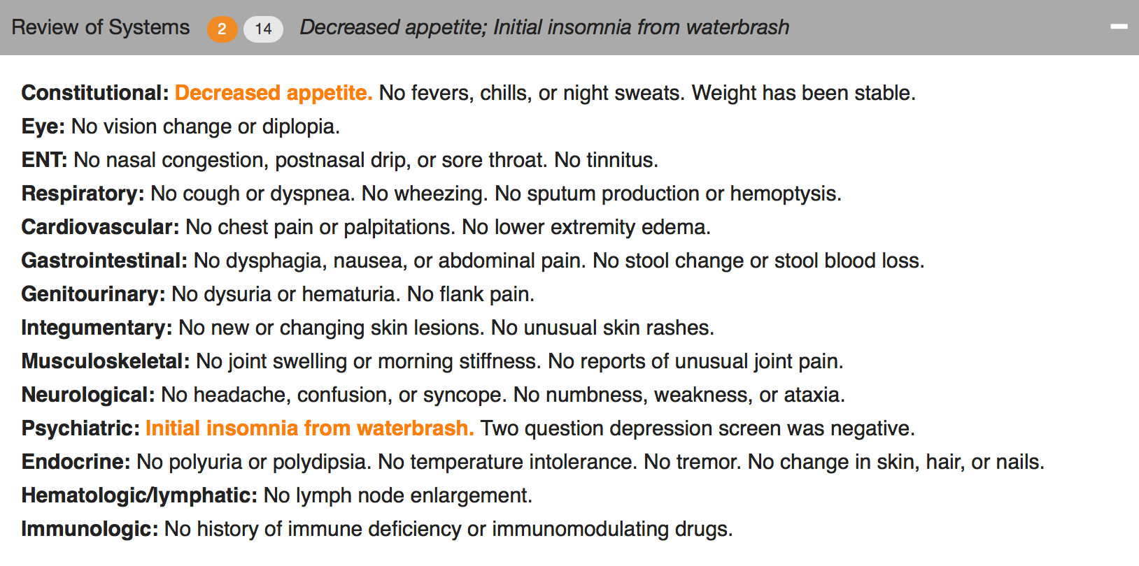
What if readers could find the sought-after details more easily by removing visual distractions? Physicians know that some parts of the notes are lists, mostly normal, but with scattered abnormal details which happen to matter most. If those lists would highlight the details that matter (the abnormals, such as "cough, fever, nausea" in the Review of Systems, or "redness, tenderness, swelling" in the Physical Exam) and visually subdue or hide the boring normal list items, then readers could see more by showing less.
Figure 2. The header can collapse and still reveal the important abnormal details.
Figure 3. Collapsed, showing only the header.
We used a couple of approaches. One was to make the abnormal terms bold and color, but leave the terms among the list text. The other was to extract the abnormal text and just display it in the header for that section (e.g. the Physical Exam), along with a "count" of abnormal items.
The challenge to implementing this is identifying the words that are abnormal.
“Abnormal values may be identified by several different mechanisms. When words are selected as discrete data elements when physicians create the note (eg, clicking on the word “fever”), it is easy and measurable if each item carries a designation as abnormal or not. Typed or transcribed text is more problematic to identify as abnormal. Natural language processing can be employed after the note is completed but adds cost, complexity, and ambiguity. Abnormal lab values can be expected to arrive with a flag denoting ab- normality (eg, a serum potassium result will have a flag for high, low, or critical if outside the normal range). If the labels of abnormality are not consistently reliable, users will not trust the information display, and its utility will suffer dramatically.”
Changing expectations for physician documentation
I think we are on the cusp of a new era when documenting the lists (used to count bullet points for fee-for-service billing) will be less necessary to prove our work as physicians. Instead, we can refocus on the patient's story, our clinical reasoning, and the plan of care, while letting the health record database carry the burden of collecting and displaying information in a meaningful way that reduces the cognitive workload of the physician. Data visualizations, dashboards, and focused reports can carry the weight that until now has been shouldered by physician notes. It's time for a change.
As patients (aka "consumers of healthcare"), we should be paying for outcomes instead of bullets.


