Information Overload or Filter Failure?

Clay Shirkey gave a talk at Web 2.0 Expo in NY  a while back titled "It's Not Information Overload. It's Filter Failure". He challenges the idea that we've got information overload problems, and he was mostly talking about media and the web. It applies in our healthcare lives as well. It is not so much information overload as a series of filter failures. Our systems for managing information abundance are swamped by the amount and growth of data that healthcare providers must manage.


Here's the presentation.

It's Not Information Overload. It's Filter Failure.

Video (23:50)

Information Chaos

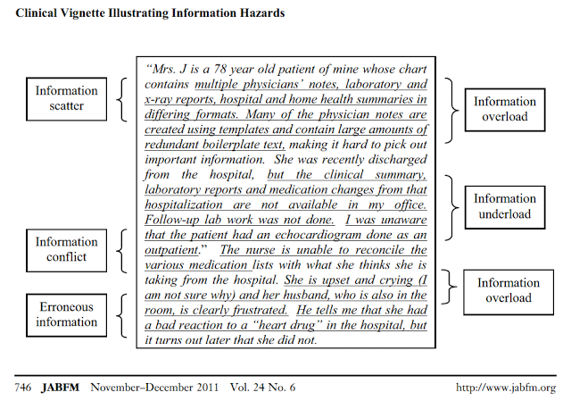
Researchers at the University of Wisconsin recently published a conceptual article on Information Chaos titled "Information Chaos in Primary Care: Implications for Physician Performance and Patient Safety" (J Am Board Fam Med, Nov-Dec 2011, 24:6, 745-751).

Figure from the article at bit.ly/InfoChaos

I had never heard the concept of "Information Scatter" articulated before, but it resonated strongly with my experience as a family physician using a variety of EMRs over the past decade.

I recently did a post on using Information Dashboards. Think of a dashboard serving the same purpose as the dashboard in your car. It gives you the critical information you need for the task at hand.

  • When you start the car, you get the messages like "time to service your car" or "hey! check your engine".
  • When you are driving, you get speed, fuel status, turn signal indicators, bright light indicators, etc. 
    • You don't have to navigate somewhere else for additional information to do the task of driving.
    • You don't get unnecessary information that is not actionable during the act of driving.

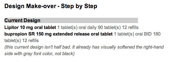
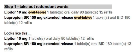
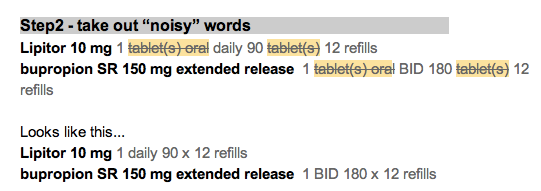
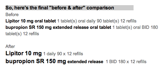
Dashboards are well suited to reducing information scatter, and they help manage information overload when skillfully designed. A key feature that is often overlooked is to pare away all unnecessary data elements (removing words that don't add value).  For example, "lisinopril 10 mg daily", and not "lisinopril 10 mg 1 tablet oral daily".

Why dashboards?

Dashboard views should be the rule rather than the exception in EHR design
Physicians and nurses have to deal with complex data involving a number of realms, making quick judgments based on the overview of the patient's story.


Dashboards beat nested navigation in several ways:
  1. They minimize navigation.
  2. They reduce cognitive load by presenting the needed information in a single view. 
    1. Users don't have to think "What next? Where next? 
    2. Users don't have to use visual memory to recall the last page view: "What was that potassium value I saw seconds ago? Was that drug dose once a day or twice day?"
    3. Users can "scan the scene" to quickly see if there are any abnormals. If the view is "clean", then we can move on.
  3. They accommodate a variety of workflow styles. Methodical  or meandering paths work equally well when only the eye (and not the finger) does the walking. ABCDE sequence is as easy as AEDCB.
  4. They can be customized or personalized to meet unique user needs.
There are some caveats.
  1. Provide only the information needed for the tasks at hand. No more, and no less. That may mean leaving out detail from the grand view, while making that detail available when drilling down.
  2. Use visual cues. They don't have to be words. They do need to be recognizable at a glance. Think icons and traffic lights. 
  3. Try the designs out on real world users.

NIST to host workshop on EHR Usability June 7, 2011


Here's a blurb from the NIST website.
It's gratifying to see attention to EHR Usability growing at all levels, and for the emerging tools to put in the hands of users, developers, certification bodies, etc.

A Technical Workshop: Measuring, Evaluating and Improving the Usability of Electronic Health Records
Purpose:
The purpose of the workshop is to establish an open forum for all stakeholders, including Industry, Academia and Government to discuss and provide technical feedback toward development of EHR usability evaluation methods.
The day's events will examine:
  • What facets of usability should be measured?
  • What measurement methods and protocols should be used to do this?
  • What are some of the challenges to rigorous measurement and how can they be addressed?
  • How can measurement results stimulate a market and support improved usability?
The sessions will be a combination of presentations, panels, and highly interactive small group discussions. 
Details:
Start Date: Tuesday, June 7, 2011 
Format: Workshop 
Technical Contact:
Mala Ramaiah
mala.ramaish@nist.gov"

Catch 22: the case for the 13 month year.

I don’t like to work. 

Correction, I do like to work; it’s my opium.

I just don’t like to do avoidable work, particularly, avoidable re-work.

    I have to do that every day. And so do doctors all across the country. Here are some reasons why:
  • Most refill plans cover 90 days with 3 refills or 30 days with 11 refills. Do the math. That comes out to 360 days a year. That is at least 5 or 6 days short by my last count.  Catch 22.
  • Why does that cause a problem? Because insurance companies also refuse to pay for annual visits if it’s not at least 365 days after the last one ("next year"). So a woman who is going to run out of her birth control pills before she can get her annual Pap smear done. 
    • She will run out of medicine before the year is up. 
    • I will get a phone call. 
    • It’s completely predictable and avoidable work.
    • Even worse, people with chronic pain taking opioids (controlled substances)  can only get a 30 day supply, thus they will run out for a whole day in a 31 day month. 

So I am going to make the case for the 13 month year. All prescriptions should be extendable for 13 months. That gives you one month’s worth of grace. Patients get grace. Doctors get a little more peace and quiet to do the REAL work that needs to be done.

While we're at it, make one more programming tweak: The default refill quantities should be 31 days and 93 days.

Teaching with Online Video

Yesterday, one of my family medicine colleagues was bemoaning how long it was taking him to renew prescriptions on his chronically ill outpatients during an office visit. Six minutes! That is untenably long.

I asked him to show me what his experience was. I quickly saw that I could tell him 4 tiny adjustments to make that would cut that time in half or better, and could reduce the number of clicks by two-thirds.

Why didn't this smart man figure out these details? He is not a technophobe.

Why didn't our training do a better job of addressing these details? (Hint: why can't you learn Photoshop in 90 minutes?).

It became obvious that the best way to inform and inspire adult learners was to use narrated video. I can show the hard way. Then I can show the easy way that makes the time savings obvious.

These videos should be 60-90 seconds in length. The example here is a little long. Three minute videos will not be watched by many email readers. Post the length. 

Here's an example:

Does prescribing or renewing medications take you way too long? If so, here's help. Take 2 minutes to watch this video. Impatient? Scroll down and read the bottom line. Watch video (2:16)
In short,
  • Maximize all your window space by moving the left-sided items out of the way.
  • Make the Order Detail window big enough to see all without scrolling.
  • Use the two navigation shortcut buttons to move from one medication entry to the next, and to move to the next incomplete field.
  • Don't collapse or expand window otherwise. That is wasted effort and needless suffering.

This AM, I watched a TED Talk by Salman Kahn titled "Let's use video to reinvent education". It was inspiring. It relates to what I had to say above as well. Watch it below.

Medications List - Visual Design Make-over

Attribution

Some rights reserved by CarbonNYC

I'm reading "Designing with the Mind in Mind: Simple Guide to Understanding User Interface Design Rules" by Jeff Johnson. As a typography/layout and design geek, some things are obvious to me, but Jeff Johnson reminds me they are not obvious to everyone. He even makes explicit the cognitive psychology behind the "design rules" that have been gospel to designers.

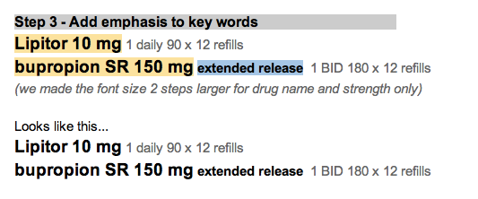
I'll give his teaching a test drive here, starting with a design from a typical EHR.

Design Make-over - Step by Step