medications

Sketching bad ideas for medication timelines

Sketching timelines

I first started thinking about graphical timelines when our team at University Missouri was working with our electronic health record vendor, Cerner, on a timeline for microbiology results (blood cultures and urine cultures). It was challenging to design timelines that were concise, intuitive, and effective.

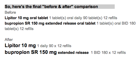
A medication timeline will be far more helpful to me as a family physician, since I often struggle to understand a patient's medication history over the preceding years. it is difficult to find out when the medication was started or stopped, when it was was changed, and whether a medication had been tried in the past.

Fail early, fail often

I made a number of failed pencil sketches that I've shown here that were ineffective at handling the cognitive challenge.

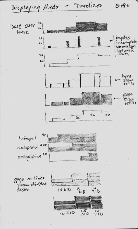
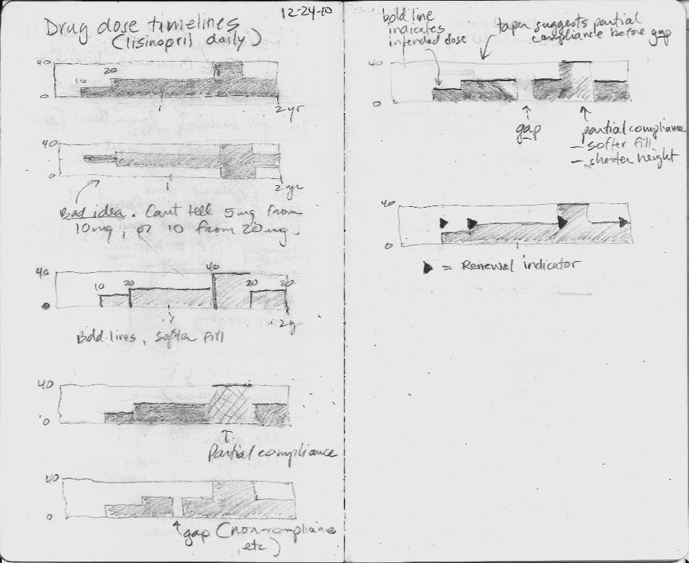
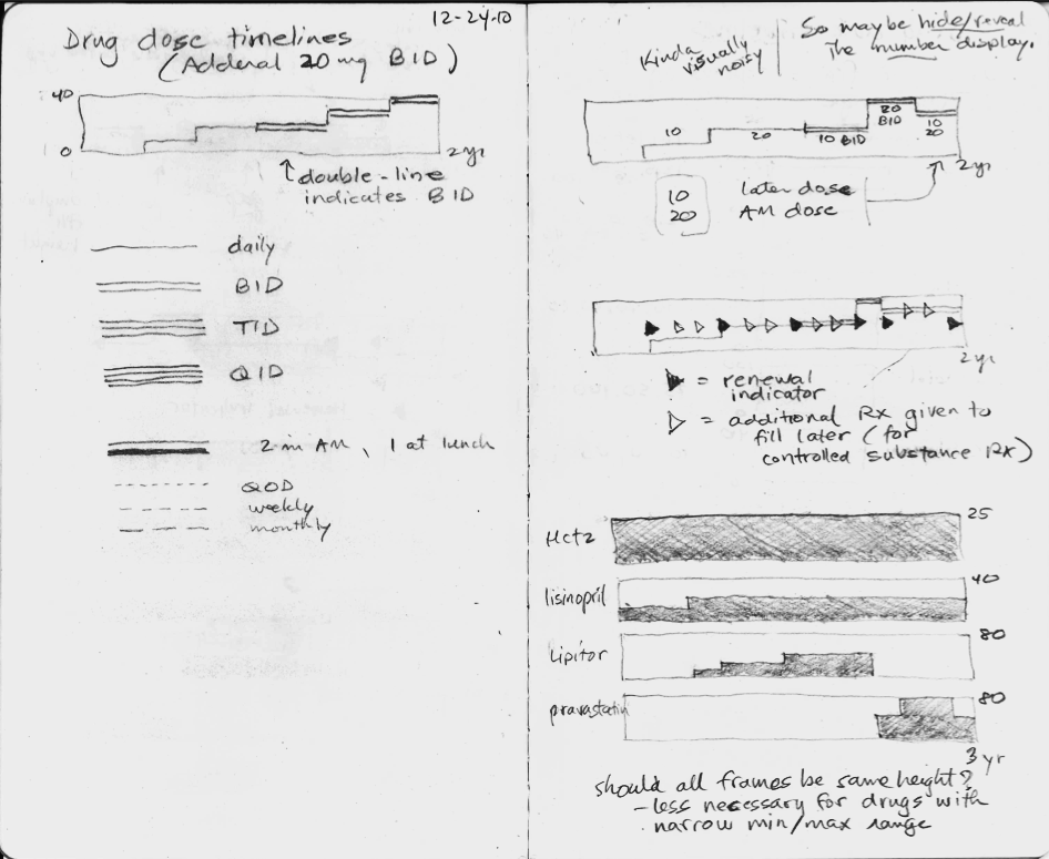
In the sketches, I explored using the height of the graph to display the dose, but none of the ideas really worked, mostly because they did not scale when the dose range could vary 16-fold or more. The dose of lisinopril can range from 2.5 mg to 80 mg daily, for instance.

Inspired by flight search

Then one day I was inspired by the beautiful and elegant visual design used by the flight search engine, Hipmunk. I immediately imagined an intuitive way to display a medication timeline.

In the process of making this online book, Inspired EHRs: Designing for Clinicians available freely online at inspiredEHRs.org, our design team had internal arguments about whether to make the timelines different hues of color, or whether to vary the line width of the bars. I think we made the right decision ultimately. By sticking with grayscale, we can then temporarily paint certain line categories different colors to give them visual meaning. For instance, all the hypertension drugs could be colored orange temporarily, to help the user see when the hypertension drug changes occurred.

Take the medication timeline for a spin 

You'll find it here. See if it's intuitive you, or if there are some ways it could be improved. Let us know if you have feedback at inspiredEHRs.org/feedback. If you're aware of any EHR that is using a medication timeline, let us know at inspiredEHRs.org/feedback.

Medication Name Basics: Making it safer with Smart Design

Making a list of your medications should be a simple endeavor, but it isn't. 

There are so many ways it can go wrong. If it's in your own handwriting, you're off to a good start for your own private purposes, but that same simple elegance can fail when the list tries to support a conversation with someone else like your physician, your spouse, or a care-giver.

You might not want to write "hydrochlorothiazide" and are content to write "BP med", when your only other medication is ibuprofen (non-prescription) and omeprazole (non-prescription). But once you join the aging elders gang, then the task is more daunting. You might have 3 "BP meds", and the doses keep changing, and the names aren't always easier to pronounce or spell.

Danger lurks!!

Good news, though. We can make these lists safer with "Smart Design". What I mean by smart design includes the following features:

  • accurate
  • readable
  • scannable
  • safe
  • contains everything you need, and nothing more
  • Done with good "graphic design principles" using:
    • contrast
    • repetition
    • alignment
    • proximity
    • Done with good "cognitive science principles" that account for how we:
      • see
      • read
      • think
      • focus attention
      • remember
      • decide
      • Done with good "data visualization principles"(when interactive) that foster exploration for meaning:
        • overview first
        • then zoom and filter
        • then drill for details on demand

Here's a simple example with explanation as we go along.

Let's start with 1 medication today. We'll show the name of the medication, how to take it, and explain why the design details matter for understanding and safety.

That seems simple. Here's how it's not, and how I'd make it better. 

The name should be bold.

... and bigger. It's the name that the eye is scanning for. 

By making it larger and darker, the eye moves there in an instant. 

[footnote 1: more about that at Ware. Visual Thinking for Design]

Make the dosage (tablet size) bigger, since it belongs to the name. Leave the Instructions the same size.

In fact, let's subdue the instructions  since that is secondary information, and not what the eye is scanning for. It's a detail for later.

By subduing the instructions with softer gray text, it allows the eye to scan for "the main thing" by reducing visual noise. We like the original Google search page because it eliminated visual noise. 

Now we need to add something that's missing.

A lot of doctors and nurses will just jot down the abbreviation, or the medication bottle label will truncate it God-knows-where.

So,

add the common alternative names

for your region of the world. Keep them subdued though. They are not the main event. Some names are easy to spell, but still hard to pronounce. 

The alternative names should be near the main name, not far to the right, and not competing visually with the main name.

How should the "main name" be chosen?

I think it should be the same as the name on the medication bottle. If we all try (prescribers, pharmacists, nurses, patients and families), we can use the same name all the time to reduce confusion. Use the nicknames when you and your conversation partners choose to. I don't mind using the brand name "Lasix" instead of "furosemide" when it makes conversation easier. We all need to have a shared understanding that "furosemide" will be the "main name" when it's written down on lists and labels.

In the next post, I'll show a short list of 4 medications  and what additional features you need with a simple printed list suitable for your wallet.

  • metformin
  • hydrochlorothiazide
  • lisinopril 
  • metoprolol

Delightful Demo of Medication Reconciliation Prototype

Our colleagues at the University of Maryland Human-Computer Interaction Lab have produced a dramatically effective prototype for medication reconciliation. It is amazingly effective, and gets better with each revision (I'm aware of three versions).

What is medication reconciliation?

That's when a healthcare provider has to compare two versions of your medication list. Say you go see your physician, who gives you a printed copy of your medication list as it was the last time you visited them. Now, you compare it to your personal list (or sack of bottles) of medicine. Do they match? If not, what's missing, what's extra, or what has changed?

If you think that sounds easy, you might think otherwise if you happen to be taking a dozen different medications. It's not that far fetched if you have the big 4 (diabetes, high blood pressure, high cholesterol, and obesity), and then toss in a couple more problems (depression, arthritis, sexual disorders). It's easy to rack up 1-3 medicines per problem.

Watch this short video to see what reconciliation involves. Dr. Catherine Plaisant narrates.


What's the big deal?

When I show this to physicians and nurses who have to do this job manually every day, they are amazed and impressed, and they want it NOW in their own electronic health record software!

Here are some features that make it so effective:

  • Animation: The logic becomes transparent
  • Proximity: Like items merge, unlike items move farther apart
  • Alignment: Columns convey meaning, and condensing adds visual efficiency
  • Color: Meaningfully employed. Green is ready to go, gray is retired to the sidelines.
  • Cognitive effort reduced: Software does the matching, rearranging and condensing, then proposes "near matches" for human adjudication.
  • Highlight differences: The text that doesn't match in two items is highlighted, adding efficiency, accuracy, and safety.

Can't you just include a picture of my pill?

I've been involved in numerous conversations about medication lists that our healthcare organizations give to patients, and meaningful use rules require the lists. I used to think it was a hopeless cause to get the picture of the pill your pharmacist gave you at your last refill into your personal medication list.

I am not so hopeless, but I remain sanguine. The incentives aren't aligned yet among all the stakeholders. The data doesn't flow freely. It's a rare patient that would use their smartphone to photograph their pills (good lighting and backgrounds are hard!) to include them in their Personal Health Record (PHR), if they are one of the rare people who maintain a PHR.

So, to give you a taste of the challenges, here is a short video showing the different colors and shapes of one single generically available pill: lisinopril. I captured it from ePocrates, which is a wonderful tool for providers.


If it's a brand name drug (for example, Crestor), getting a picture is far easier.


There is a code called the NDC code that tells the pharmacist which exact generic version of your lisinopril you are taking, but your doctor doesn't know (or care, generally) which NDC code is your particular lisinopril. But as we (patients, nurses, doctors, and pharmacists) start coming to expect the pill pictures as part of our conversations, then the NDC code sharing will become more important.

It's in our future, but not our present.

Medications List - Visual Design Make-over

Attribution

Some rights reserved by CarbonNYC

I'm reading "Designing with the Mind in Mind: Simple Guide to Understanding User Interface Design Rules" by Jeff Johnson. As a typography/layout and design geek, some things are obvious to me, but Jeff Johnson reminds me they are not obvious to everyone. He even makes explicit the cognitive psychology behind the "design rules" that have been gospel to designers.

I'll give his teaching a test drive here, starting with a design from a typical EHR.

Design Make-over - Step by Step

Refill alerts on a medication list - help reduce unnecessary work

What if the doctor and patient took care of all the necessary work at a visit for managing chronic disease?

Disclosure: I hate getting calls and faxes for refill requests. It seems totally avoidable. I’m not winning this battle.

It’s fairly common for primary care physician offices to get dozens of phone calls or faxes a week about medication refills.

    It might be about a patient I just saw last week.
  • These calls take time and money: mine and the staff.
  • This is unreimbursed work.
  • I get whiney about it.

If there is a discrepancy between the pharmacy (or patient) request and my records, it gets a lot worse.

Then calls go back and forth, trying to reconcile the difference, and the outcome is not always satisfactory.

So, what can we do about it?

How about adding a little alert to the medication list?

  • Don’t make me think (that is, don’t make me “sort by last refill date”, figure out the interval since last refill, count the meds and remember their names), just show me!
  • Dark red (or gray) could mean “due for refill in <3 months”.
  • Pink (or lighter gray) could mean “due for refill in <6 months”.
  • These intervals (3 and 6 months) match the numbers for “frequency of diabetic lab tests” and “limit on controlled substance refills”.

With this information right in my face, it would be easy to see if, and which, medications need to be refilled today. That avoids an extra call for the patient, an extra fax/call or two for my staff, and a headache for me.

That makes me happy!

(special thanks for the idea to Phil Vinyard at University Physicians Family Medicine Clinics)

How should drug interaction warning screens look?

Most clinicians I know suffer from "alert fatigue". I don't mean they feel tired from too much caffeine.

I mean, they are tired of EHR software crying wolf with too many drug interaction warnings. Embattled users simply dismiss all drug interaction warnings without reading them. Mild or theoretical interactions should be suppressable by individual user preference, as a default setting.

This is a significant patient safety issue.

If I am relying on my software to warn me about serious drug interactions, then the warnings about milder or dubious interactions are annoying, distracting false alarms. I need to be aware of serious interactions, so I can adjust therapy.

Here's another problem: I get warned that drug A interacts with drug B. I dismiss the warning. Then I immediately get warned that drug B interacts with drug A. I know that!

Worse yet, if I then change the dose of drug A, I get warned all over again. We need smarter systems now, geared to what fallable, imperfect, tired human users need, and geared to keeping patients safe.

Here is a modest proposal of a way to display drug interactions.

Drug-Drug_interaction_alert_sketch.jpg

Note that the key findings are in the middle, the drug names are prominent, the severity level is great big number, and user pref settings are right there.

Posted by Picasa

Are you still taking Prozac?

Reviewing the medication list is a routine part of the visit for patients with chronic visits, or those needing refills. This is often not such a simple task. The tools we have are flawed in the world of EMR's. They improve on the written list by making changes dynamic and instantaneous. They make doing refills much simpler.

Many med list modules are limited and assume a fairly black and white reality: The doctor ordered it. You took it. You got better.

The real world is more chaotic and variable. We need systems that allow adding qualifiers, to cover circumstances like these:

  1. I cut it back to one a day, so I wouldn’t run out before this appointment
  2. The pharmacy switched me to the one covered by my insurance
  3. They stopped that when I left the hospital. Should I still be taking it?
  4. I'm not taking it yet. I plan to get that medicine this Friday, when I get paid.
  5. I went to get it, and the copay was $75! So I didn't get it.

So the modern medicine list needs to accommodate the vagaries of the real world. Here are some of the features needed in an ideal EMR medication module:

    The basics (you can skip over this section!):
    1. name of drug (generic and brand name)
    2. dosage and form
    3. when and how taken (in patient-friendly language, and large-enough font for age)
    4. purpose (the reason, not the ICD-9 description)
    5. start and stop dates
    6. quantities
    7. number of refills
    8. refill dates
    9. who prescribed it
    Other predictable features that are needed, but rarely present today:
    1. Danger signs (e.g. symptoms to report promptly)
    2. Monitoring required (e.g. periodic lab)
    3. Notes about side-effects, dose adjustments, food-drug or drug-drug interactions to be alert for.
    Weird events that are harder to describe:
    1. I ran out ____ days/weeks/months ago.
    2. I was about to run out, so I reduced the dose by ____% about ____ days/weeks/months ago.
    3. I thought it was causing me problems/wasn't working, so I reduced/increased the dose.
    4. I forget a lot of doses, especially the evening ones.
    5. I ran out of the Nexium, so your nurse gave me some Prevacid samples, and my sister had some left-over Protonix she gave me for a couple weeks.

Can you think of other weird events to consider in the ideal med list design?

Notes:
For a model med list, see: Med List (a Microsoft Word document) from the Massachusetts Coalition for the Prevention of Medical Errors. It includes a number of helpful features to promote safety and clear communication.