EHR

Discrete data kills a story

This is a faxed note from a physician’s office about someone you don’t know.

This is fairly typical of a modern EHR note “created” (or stillborn) by clicking on word choices from a list. The lists are designed with an eye toward being able to bill for the actual work done during the visit. The result is awful. Every doctor in the world would agree.

We can do better. We must try. Think of the reader caring for this patient later.

EHRNoteHardToRead.jpg
MeaningfulWordsAreHighlighted.jpg
HurtsMyBrain.jpg

 This would have said the same thing:

He is here to follow-up on his SLE with renal disease, moderate proteinuria, hypertension, and hyperlipidemia.

A slightly more readable version (because it's a list) would be:

He is here to follow-up on his:

  • SLE with renal disease
  • moderate proteinuria
  • hypertension
  • hyperlipidemia

I think we physicians need to tell patients' stories, not just collect bullet points for billing. A well crafted, readable narrative will contain the data to justify the billing. If our typing skills are weak, we can learn voice recognition. 

Our EHR Usability book is born: We're naming it 'Inspired EHRs: Designing for Clinicians'

Inspired EHRs: Designing for Clinicians (formerly EHR Usability Style Guide) is a generously illustrated, interactive e-book for health IT developers, whether EHR / PHR / healthcare app software vendors, EHR client organization implementation teams, EHR consultants, or usability professionals. We made this book to be clinically relevant, inspirational, and illustrative, but not prescriptive. Freely available on the web at inspiredEHRs.org, it's available as a PDF version as well. 

Medication Timeline. Traveling back in time to see past medication use at a glance.

Written in an accessible, science journalist style, the book was developed in a series of workshops with the support and encouragement of our colleagues of the Electronic Health Record Association (EHRA) Clinician Experience Workgroup. This book was made possible thanks to the generous support of the SHARP-C Project of the Office of the National Coordinator of Health IT and the California HealthCare Foundation. The team, based at the University of Missouri-Columbia in partnership with Involution Studios Boston included colleagues from the University of Maryland Human-Computer Interaction Lab and The University of Texas Health Sciences Center-Houston.
 
We hope to produce a series of similar interactive e-books on related health IT topics. 

The content of this book and the code of its prototypes is made available under the Apache 2.0 open source license. This license agreement allows anyone to freely use the code and ideas presented in this book, subject to the conditions listed at http://opensource.org/licenses/Apache-2.0.

To provide feedback on the book, email us at feedback@inspiredEHRs.org.
To discuss future books, email me at beldenj@health.missouri.edu.

Enjoy!


Jeff Belden MD 
Project Leader for Inspired EHRs: Designing for Clinicians at inspiredEHRs.org
Twitter: @inspiredEHRs, @jeffbelden, @toomanyclicks

Writing the EHR Usability Style Guide

I haven't posted here much lately. I've been leading a team writing an EHR Usability Style Guide with the community of EHR vendors as the target audience. I might call it "EHR Style Guide: Killer Design - Safe at Any Speed".

If you are attending HIMSS Annual Conference in Orlando this week, I'd be glad to tell you more about it. I'll be presenting to a meeting of EHRA stakeholders Tuesday AM at 1000 in Room West 106 (reservations required for that one), hosted by the EHRA Clinician Experience Workgroup. This group has been very supportive of our effort, including some of its members attending our 2-3 day design workshops at their own expense.

If you can't make that meeting, I'll be attending most other Usability Community meetings during the week (here's that schedule) and I'd love to show you a quick tour then. I'll also be at the HIMSS pre conference workshop "Understanding Usability in Organizational Strategy" on Sunday.

Here's a glimpse at some content from the book.

Medication Timeline

It's hell to figure out the historical course of a patient's medications. It's even worse when the patient is taking 20+ medications that have been started, stopped, and adjusted during transitions of care from home to hospital to extended care and back. 

We have a cure.

A graphical medication timeline is visually intuitive, a breeze to learn, and packs a lot into a  small space. Here's a screenshot of our working prototype.

MedTimelineScreenShot_2014Feb.png

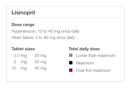
There are a few simple rules that you need to know. Black is the maximum dose (for that med for that particular diagnosis – see the illustration below), gray is less, lighter is lower. If you've played with stock market timelines, you'll know how to drive this one.

UM_EHR_0009_lisinopril_TimelineHowTo.png

I've shown timeline sketches to physicians who can look at the timeline and recreate a plausible clinical scenario from the timeline graph alone. This kind of data visualization can markedly reduce cognitive load (mental effort), making it easier to spot trends and see the interrelationships between different medication courses. It should be safer as well. I think it's fun!

When will the EHR Usability Style Guide be available?

I'll give a sneak preview to anyone this week. The final product will be available on July 1, 2014 on the Apple iBookstore and on the web. I'll tell you how to get it as the release day approaches. I'll tell you more about our team and the sponsors later. These illustrations were done by Jennifer Patel at Involution Studios in Boston, our design firm. You can follow me an Twitter at @jeffbelden or @toomanyclicks. I'll tweet when I post here again.

Abbreviations: HIMSS (Health Information Management Systems Society); EHRA (Electronic Health Records Association)