Writing the EHR Usability Style Guide

I haven't posted here much lately. I've been leading a team writing an EHR Usability Style Guide with the community of EHR vendors as the target audience. I might call it "EHR Style Guide: Killer Design - Safe at Any Speed".

If you are attending HIMSS Annual Conference in Orlando this week, I'd be glad to tell you more about it. I'll be presenting to a meeting of EHRA stakeholders Tuesday AM at 1000 in Room West 106 (reservations required for that one), hosted by the EHRA Clinician Experience Workgroup. This group has been very supportive of our effort, including some of its members attending our 2-3 day design workshops at their own expense.

If you can't make that meeting, I'll be attending most other Usability Community meetings during the week (here's that schedule) and I'd love to show you a quick tour then. I'll also be at the HIMSS pre conference workshop "Understanding Usability in Organizational Strategy" on Sunday.

Here's a glimpse at some content from the book.

Medication Timeline

It's hell to figure out the historical course of a patient's medications. It's even worse when the patient is taking 20+ medications that have been started, stopped, and adjusted during transitions of care from home to hospital to extended care and back. 

We have a cure.

A graphical medication timeline is visually intuitive, a breeze to learn, and packs a lot into a  small space. Here's a screenshot of our working prototype.

MedTimelineScreenShot_2014Feb.png

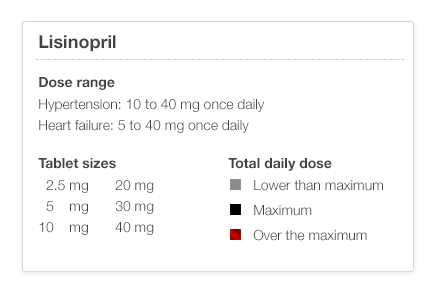
There are a few simple rules that you need to know. Black is the maximum dose (for that med for that particular diagnosis – see the illustration below), gray is less, lighter is lower. If you've played with stock market timelines, you'll know how to drive this one.

UM_EHR_0009_lisinopril_TimelineHowTo.png

I've shown timeline sketches to physicians who can look at the timeline and recreate a plausible clinical scenario from the timeline graph alone. This kind of data visualization can markedly reduce cognitive load (mental effort), making it easier to spot trends and see the interrelationships between different medication courses. It should be safer as well. I think it's fun!

When will the EHR Usability Style Guide be available?

I'll give a sneak preview to anyone this week. The final product will be available on July 1, 2014 on the Apple iBookstore and on the web. I'll tell you how to get it as the release day approaches. I'll tell you more about our team and the sponsors later. These illustrations were done by Jennifer Patel at Involution Studios in Boston, our design firm. You can follow me an Twitter at @jeffbelden or @toomanyclicks. I'll tweet when I post here again.

Abbreviations: HIMSS (Health Information Management Systems Society); EHRA (Electronic Health Records Association)

We moved our hosting

Now TooManyClicks.com will be living at a new host, Squarespace. I was busy with other projects for a while, so this transition languished at several stages. But we're back and bursting with ideas. Anytime I speak with physicians about their EHR life, their passion ignites. Most of the passion is an urgent longing for something better.  

Subscribe to this blog, or follow us on Twitter at @toomanyclicks.

Medication Name Basics: Making it safer with Smart Design

Making a list of your medications should be a simple endeavor, but it isn't. 

There are so many ways it can go wrong. If it's in your own handwriting, you're off to a good start for your own private purposes, but that same simple elegance can fail when the list tries to support a conversation with someone else like your physician, your spouse, or a care-giver.

You might not want to write "hydrochlorothiazide" and are content to write "BP med", when your only other medication is ibuprofen (non-prescription) and omeprazole (non-prescription). But once you join the aging elders gang, then the task is more daunting. You might have 3 "BP meds", and the doses keep changing, and the names aren't always easier to pronounce or spell.

Danger lurks!!

Good news, though. We can make these lists safer with "Smart Design". What I mean by smart design includes the following features:

  • accurate
  • readable
  • scannable
  • safe
  • contains everything you need, and nothing more
  • Done with good "graphic design principles" using:
    • contrast
    • repetition
    • alignment
    • proximity
    • Done with good "cognitive science principles" that account for how we:
      • see
      • read
      • think
      • focus attention
      • remember
      • decide
      • Done with good "data visualization principles"(when interactive) that foster exploration for meaning:
        • overview first
        • then zoom and filter
        • then drill for details on demand

Here's a simple example with explanation as we go along.

Let's start with 1 medication today. We'll show the name of the medication, how to take it, and explain why the design details matter for understanding and safety.

That seems simple. Here's how it's not, and how I'd make it better. 

The name should be bold.

... and bigger. It's the name that the eye is scanning for. 

By making it larger and darker, the eye moves there in an instant. 

[footnote 1: more about that at Ware. Visual Thinking for Design]

Make the dosage (tablet size) bigger, since it belongs to the name. Leave the Instructions the same size.

In fact, let's subdue the instructions  since that is secondary information, and not what the eye is scanning for. It's a detail for later.

By subduing the instructions with softer gray text, it allows the eye to scan for "the main thing" by reducing visual noise. We like the original Google search page because it eliminated visual noise. 

Now we need to add something that's missing.

A lot of doctors and nurses will just jot down the abbreviation, or the medication bottle label will truncate it God-knows-where.

So,

add the common alternative names

for your region of the world. Keep them subdued though. They are not the main event. Some names are easy to spell, but still hard to pronounce. 

The alternative names should be near the main name, not far to the right, and not competing visually with the main name.

How should the "main name" be chosen?

I think it should be the same as the name on the medication bottle. If we all try (prescribers, pharmacists, nurses, patients and families), we can use the same name all the time to reduce confusion. Use the nicknames when you and your conversation partners choose to. I don't mind using the brand name "Lasix" instead of "furosemide" when it makes conversation easier. We all need to have a shared understanding that "furosemide" will be the "main name" when it's written down on lists and labels.

In the next post, I'll show a short list of 4 medications  and what additional features you need with a simple printed list suitable for your wallet.

  • metformin
  • hydrochlorothiazide
  • lisinopril 
  • metoprolol

Medication List - Sorting things out

I'm going to take you on a journey of prescribing medications for a person with several chronic diseases visiting their family doctor. Along the way we're going to make three stops.

  1. Seeing what medications the patient is already taking.
  2. Figuring out if a change is required.
  3. Picking the medication and making the change (or adding a new one).
One reason I'd like to take you on this journey, is to help you appreciate how well-designed tools make the job easier. If you've ever tried to fix something with a pair of pliers when you really needed a socket wrench, then you'll know what I mean.

Reviewing the list


As a family physician, I see people in my office with many chronic diseases (high blood pressure, diabetes, high cholesterol, osteoarthritis, depression, low back pain, obesity, etc.) who take quite a few medications. It's pretty common for somebody to have at least 10 chronic problems and 10 to 20 chronic medications. It's increasingly common for people to be on 3 or more blood pressure medications.

I need to refer to the medication list a few times during an office visit. Different versions of the list can make each task easier. Initially I look at the list to get an overview of what medications the person is taking.

What seems to be your problem today?

Then I look to see what problems might be needing some attention. Review lab. Talk to the patient. Look at recent reports from the emergency room or other specialists. Review phone call notes.

  • Is the blood pressure controlled? 
  • Are the latest lab results on target? 
  • Is a preventive service due? (mammograms, Pap smear, colonoscopy, oil change, tire rotation) 

It's time for a change

If one of those issues requires a new prescription, then I need to look at the medication list again to see medications are already prescribed for that problem. 

Let's say that their blood pressure is not quite controlled and we need to make an adjustment in the medication. 

First, I look at the list to see what high blood pressure medications the person is already taking. I have to read the list and ask myself for each medication, "is this for high blood pressure? or this one? or this one?..." It takes quite a while and a lot of mental effort (that's called "cognitive load"). It would be a lot smarter if I could just glance and see all the high blood pressure medicines adjacent to one another (by sorting the list). It would be even easier if I could see only all the high blood pressure medications (by filtering the list), just for a second. 

Then, among those medications, I need to figure out what dose the person is taking, and if that's the maximum dose. If we've already reached maximum dose, then I'll have to pick a new medication.
If not, then I can increase the dose of the medication that hasn't reached to maximum dose.

Take your pick

If I do need to pick a new medication, then I will look at the problem list to simplify things and to avoid new conflicts.  I want to see what concurrent diesases (called "co-morbidities") the person has. If they also have migraines or irregular heartbeat, then I would choose a beta blocker or maybe a calcium-channel blocker. If they also have diabetes, that I might choose an ace inhibitor or and ARB (angiotensin-receptor blocker), if they're not already taking one of those drugs. In some cases, I avoid a particular drug (no Actos for you if you have heart failure already).

So you see, it's quite a bit of mental effort to just figure out how to add one more drug.

A well-designed EHR will lighten the cognitive load dramatically. All the required information needs to be viewed in a single view without scrolling and without navigating around. At a minimum, that information includes the patient's active problem list, and all the current medications with those details visible. It's important to not include more information than necessary, because the extra information just clutters the view and makes it harder to think or to notice what's important. If you've ever driven through an unfamiliar, busy urban highway intersection and had to read multiple signs at once, you'll appreciate the difficulty. Aircraft crew flight deck (control panels) design teams pay close attention to this, aiming for "quiet dark".

Now you try it

I made a little interactive widget you can play with here
[Note: Blogger and my HTML tool Tumult Hype don't allow me to embed the widget. I guess I'll move to Squarespace hosting soon.]
Ask your self these questions: 
  1. In the first screen, can you tell which medications are prescribed for high blood pressure (hypertension)?
  2. With the diagnoses visible, does it matter how the drug names are sorted?
  3. How much extra time does it take to find all the high BP medications in the different views?
  4. Can you tell if a medication dose is the maximum dose for that medication? (Hint: no, but I'll show you a cool way to do that in a later post.)


Delightful Demo of Medication Reconciliation Prototype

Our colleagues at the University of Maryland Human-Computer Interaction Lab have produced a dramatically effective prototype for medication reconciliation. It is amazingly effective, and gets better with each revision (I'm aware of three versions).

What is medication reconciliation?

That's when a healthcare provider has to compare two versions of your medication list. Say you go see your physician, who gives you a printed copy of your medication list as it was the last time you visited them. Now, you compare it to your personal list (or sack of bottles) of medicine. Do they match? If not, what's missing, what's extra, or what has changed?

If you think that sounds easy, you might think otherwise if you happen to be taking a dozen different medications. It's not that far fetched if you have the big 4 (diabetes, high blood pressure, high cholesterol, and obesity), and then toss in a couple more problems (depression, arthritis, sexual disorders). It's easy to rack up 1-3 medicines per problem.

Watch this short video to see what reconciliation involves. Dr. Catherine Plaisant narrates.


What's the big deal?

When I show this to physicians and nurses who have to do this job manually every day, they are amazed and impressed, and they want it NOW in their own electronic health record software!

Here are some features that make it so effective:

  • Animation: The logic becomes transparent
  • Proximity: Like items merge, unlike items move farther apart
  • Alignment: Columns convey meaning, and condensing adds visual efficiency
  • Color: Meaningfully employed. Green is ready to go, gray is retired to the sidelines.
  • Cognitive effort reduced: Software does the matching, rearranging and condensing, then proposes "near matches" for human adjudication.
  • Highlight differences: The text that doesn't match in two items is highlighted, adding efficiency, accuracy, and safety.

Dashboards - Quality Performance at the Point of Care

I used to get quality reports once a year, then once a quarter. They were long, opaque, boring, and too detailed to digest. I was usually looking at them when I was too tired (at the end of a long day) and away from the battlefield. As a result, nothing much changed.

So, our team decided to provide "just in time" quality feedback to physicians at the point of care, and only for diabetes, and only for 8 quality indicators (there are dozens competing for my attention). The hope was that by giving feedback as the physician was about to see the patient, then she could take action and address the issues of concern. Here's what we built:

diabetes dashboard
Fig 1. Diabetes Dashboard

Here's a closer view of just the bottom of the dashboard showing the Quality Performance Indicators (back then, the Medicare Quality Program was called "PQRI"):
quality panel of Diabetes Dashboard
Fig. 2 The "quality panel" of the Diabetes Dashboard

I call the little red, gray, and white circles "idiot lights". A more socially acceptable term is "traffic lights". They alert the physician to the actionable items for the task at hand: "Change the medications or diet to lower the blood sugar, order the cholesterol tests and annual urine micro-albumin test, and send the patient to the eye doctor."

Does this approach work?
Yes and no.

It is much easier to see what needs to be done. The effort to navigate around to find these 8 items used to take 60 clicks and about 6 minutes to find all 8 measures in our EHR. With the dashboard, it takes 6 clicks and a minute or two. That's a huge gain in efficiency and reduction in cognitive load. It's also safer and more accurate, because, frankly, most physicians would stop looking for that last item or two (the foot exam and eye exam are hardest to find) before wasting the the whole 6 minutes.

Do physicians improve their quality scores by making this more available?
Not necessarily. It's not a required view, and it's on page 2. If my nurse prints it out, circles the items needing attention, and thrusts it in my face (we are a finely-tuned team), then things happen. Otherwise, the 15 other details may get in the way. Information helps, but system processes need to change to get results.

Can't you just include a picture of my pill?

I've been involved in numerous conversations about medication lists that our healthcare organizations give to patients, and meaningful use rules require the lists. I used to think it was a hopeless cause to get the picture of the pill your pharmacist gave you at your last refill into your personal medication list.

I am not so hopeless, but I remain sanguine. The incentives aren't aligned yet among all the stakeholders. The data doesn't flow freely. It's a rare patient that would use their smartphone to photograph their pills (good lighting and backgrounds are hard!) to include them in their Personal Health Record (PHR), if they are one of the rare people who maintain a PHR.

So, to give you a taste of the challenges, here is a short video showing the different colors and shapes of one single generically available pill: lisinopril. I captured it from ePocrates, which is a wonderful tool for providers.


If it's a brand name drug (for example, Crestor), getting a picture is far easier.


There is a code called the NDC code that tells the pharmacist which exact generic version of your lisinopril you are taking, but your doctor doesn't know (or care, generally) which NDC code is your particular lisinopril. But as we (patients, nurses, doctors, and pharmacists) start coming to expect the pill pictures as part of our conversations, then the NDC code sharing will become more important.

It's in our future, but not our present.

Information Overload or Filter Failure?

Clay Shirkey gave a talk at Web 2.0 Expo in NY  a while back titled "It's Not Information Overload. It's Filter Failure". He challenges the idea that we've got information overload problems, and he was mostly talking about media and the web. It applies in our healthcare lives as well. It is not so much information overload as a series of filter failures. Our systems for managing information abundance are swamped by the amount and growth of data that healthcare providers must manage.


Here's the presentation.

It's Not Information Overload. It's Filter Failure.

Video (23:50)