EHR

AHRQ publishes paper - "EHR Usability: Vendor Practices & Perspectives"

AHRQ just published a new white paper last week.
You can read it here as a PDF.

From World Usability Day 2006 poster
The objectives of the project that led to this paper were:

...to understand processes and practices by these vendors with regard to:
  • The existence and use of standards and “best practices” in designing, developing, and deploying products.
  • Testing and evaluating usability throughout the product life cycle.
  • Supporting post-deployment monitoring to ensure patient safety and effective use.
It's good to see continued attention to usability in the EHR/EMR world.

Personalizing User Preferences, within Guardrails

EMRs are complex applications.

No Joke.

Here's an example of a fairly typical User Preference Setting dialogs (with my annotations):

It's not always easy to find my way to the preference settings. They might be buried deep in a menu as "Options" or "Settings" or "Preferences". When I look at the options to check, it might be quite hard to understand what will happen if I check or uncheck an option.

Trainers and support staff have nightmares as a result of the complexity.

Offer users more flexibility and the troubleshooting is more complicated, but if users' initial settings are not "just right", then the application won't behave as expected.

How can we empower the physician or nurse user?

How can the preference settings be made more understandable and accessible?

How can we help users have an experience that is "right for them"?

One way would be to place the preference settings closer to where they have an effect (see mock-up image below).

  • Make the range of choices smaller (The Simplicity Principle of Usability). 
  • Make the range of choices "safer" (The Forgiveness Principle of Usability). Don't let me change things I might regret, and be unable to fix. Offer "personalization within guardrails".
  • Put the choices close to the action ("Preservation of Context" and "Efficient Interactions" Principles of Usability).

I like to call this "just-in-time personalization".

The little "gears" icon  shows up whenever there a few user preference (or "personalization") settings.

Design Thinking

I've just started reading Tim Brown's book, "Change by Design: How Design Thinking Transforms Organizations and Inspires Innovation". It quickly had me thinking about innovations in EMR usability.

Design Thinking balances three values:

Desirability, Viability, and Feasibility.

IDEO_DesirabilityViabilityFeasibility.png

[Tim Brown's illustration]

He describes desirability as meeting true human needs and desires, as opposed to the drummed up desires personified in perfume ads. On a global scale, these needs include clean water, adequate diet, good health, education for children, and a safe community.

What does "desirability" mean for EMR users?

Here are a few of my ideas. What ideas can you add?

Basic Needs & Desires for Physician and Nurse EMR Users

Rapid, easy, intuitive documentation

  • We shouldn't have to type so much. Voice recognition is nearly there, but not mainstream. Voice capture for transcription embedded into the EMR is spotty.
  • How about features like "auto-fill" used in e-commerce sites?
  • How about "predictive fill" as we see now in Google's predictive search phrases as we start to type?

Smart displays of key information for the task at hand

  • The information ought to be visible at a glance.
  • No navigation should be needed.
  • All the cognitive effort should be squeezed out of the information. Don't make me do mental math. Don't make me remember a rule, or a set of normal ranges. Leave my brain to do only the work that the computer cannot do for me.

Foster collaborative decision-making with patients and their families

  • In the hospital, acute pain med doses are often negotiated ("That medicine made me nauseated last time. Can I have something else for pain?" or "Can I have a smaller dose, so I'm not so drowsy?") Give the nurse and patient the tools to decide together.
  • In ambulatory care, physicians often explain and negotiate items like bone density scans or PSA blood tests. The guidelines recommend counseling for edge cases, like the most recent guidelines from the USPSTF for mammography for women age 40-49. Give physicians counseling tools that help patients (and doctors, for that matter) understand comparative risks. We do a poor job of that currently.

Enable user-level configurability

  • Novices have different needs from more experienced clinicians.
  • User preferences change over time. We learn. Make it easy to find and change preferences. Currently, these prefs are buried deep and are widely scattered.

How will these changes happen?

How do you design usable systems for nurses?


The Tiger Initiative has been working on the usability of clinical applications for some time now. They just published a report with recommendations. I know a few of the people involved. It's worth a look. Link


Since 2007, hundreds of volunteers have joined the TIGER Initiative to continue the action steps defined at the Summit. The TIGER Initiative is focused on using informatics tools, principles, theories and practices to enable nurses to make healthcare safer, more effective, efficient, patient-centered, timely and equitable. This goal can only be achieved if such technologies are integrated transparently into nursing practice and education. In order to meet the demands of an increasingly electronic and rapidly changing healthcare environment, it is essential to address the educational needs of the nursing workforce.

STAR Moments

I'm in a nice local coffee shop, trying to build a presentation about EMR Usability. Christmas music is playing in the background, some of it actually unique.

I think of myself as an evangelist for EMR usability.

How can I deliver a S.T.A.R. Moment for the audience? What is a S.T.A.R. Moment? It stands for "Something They'll Always Remember".

A couple of examples from Nancy Duarte's blog.

What I want for Christmas is an inspiration.

Maybe it will be some dramatic illustration of how often doctors get interrupted, or how much time it takes to do some paltry task, or how long it takes to tell a story in a progress note. Or bringing along an old Underwood typewriter. Or a tableful of clocks or timers.

What's the message?
Usability matters. Here's what it looks like. Give me some.

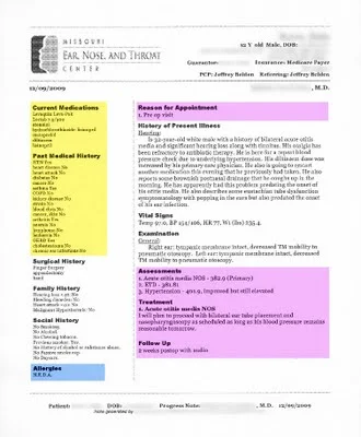
A Beautiful EMR Note!

I don't get to say this often, but this is a beautiful progress note produced by a commercial EMR. Most progress notes from EMRs look like the company fired all the people who had an eye for page layout and design.

click image below to see enlarged view

Here's what I like about this note:

  • It's visually inviting, with a very clean look.
  • Effective use of font choice, bold headers, left-alignment, rules of proximity and spacing (see prior post on C.R.A.P. design principles).
  • The left hand column gets the less critical Past History details (yellow highlight added) off to the side. This allows me to know they are out of the way as I scroll, but remain available at a glance. This should be standard in all EMRs, in my opinion.
  • I can skip directly to the sections of interest (pink highlighted added) to answer the questions: "why was this patient seen, what did the consultant think, and what is the plan?"

What could be improved?

  • Move the Assessment and Plan to the top of the note. That's what almost every reader is looking for. Why not put it first? I have a few consultants who do that routinely in their dictations, and it's always a hit.
  • Enhance the Vital Signs so they are easier to read. Add bold to labels, add more space between items.
Temp 97.0, BP 154/106, HR 77, Wt 235.4 lbs
  • Lose the underlining. It would look better this way (bold, and a step bigger)

ReasonForAppt.png

Your thoughts, readers?

Making Lists of Diagnoses to Pick From

If I can't get a list with predictive search (where the search field starts guessing what I want from the few characters I've typed so far), then at least give me a heads-up list on one page. Make the list short and comprehensive enough.

I want to find about 80% of my commonly used diagnoses on one page, then multi-select all the diagnoses that I need, and then click "OK". If I can do that, I will be very happy. I've seen it done in at least one EMR.

See, I'm not hard to please.

How would you build the list?

  1. Make a fairly comprehensive list first, sorted by how often I (or family physicians in general) select that diagnosis.
  2. Then create the list on a page or two.
  3. Then add columns (to allow more items) and shrink the font until it is still readable. Test readability with a few 50-60 year old users wearing bifocals.
  4. Trim the list to one (or two, A-L and M-Z) pages.

What are the user-centered-design principles?

  1. Get it on a single visual plane in plain sight. (expand to a second page, if needed, or if users wanted it).
  2. List alphabetically. Avoid organ system grouping, which takes more cognitive effort and more visual scanning time.
  3. Use simple, frequently-used-by-clinician word choice (e.g. “headache” instead of “cephalgia”).
  4. Put most relevant words first (e.g. “diabetes mellitus, type 2”, not “type 2 diabetes”)
  5. Make font big enough to read.
  6. Eliminate words that don’t add benefit for user (e.g. for “250.41 Diabetes 1 w/ renal changes”, do include “w/ renal changes”. For “250.00 Diabetes 2 uncomplicated”, I’d argue that the “uncomplicated” is optional, and takes up space).

The single page has some advantages over the predictive search, which can only do one diagnosis at a time.

  • I don't have to use the keyboard.
  • I can select 6 diagnoses with only 6 clicks.
  • I press OK once, and not 6 times.
  • I can go a lot faster.
  • I'll develop muscle memory finding the commonly picked items on the page (could pick them blindfolded!).

Go ahead. Make my day.