usability

Medication Name Basics: Making it safer with Smart Design

Making a list of your medications should be a simple endeavor, but it isn't. 

There are so many ways it can go wrong. If it's in your own handwriting, you're off to a good start for your own private purposes, but that same simple elegance can fail when the list tries to support a conversation with someone else like your physician, your spouse, or a care-giver.

You might not want to write "hydrochlorothiazide" and are content to write "BP med", when your only other medication is ibuprofen (non-prescription) and omeprazole (non-prescription). But once you join the aging elders gang, then the task is more daunting. You might have 3 "BP meds", and the doses keep changing, and the names aren't always easier to pronounce or spell.

Danger lurks!!

Good news, though. We can make these lists safer with "Smart Design". What I mean by smart design includes the following features:

  • accurate
  • readable
  • scannable
  • safe
  • contains everything you need, and nothing more
  • Done with good "graphic design principles" using:
    • contrast
    • repetition
    • alignment
    • proximity
    • Done with good "cognitive science principles" that account for how we:
      • see
      • read
      • think
      • focus attention
      • remember
      • decide
      • Done with good "data visualization principles"(when interactive) that foster exploration for meaning:
        • overview first
        • then zoom and filter
        • then drill for details on demand

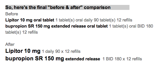
Here's a simple example with explanation as we go along.

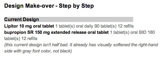
Let's start with 1 medication today. We'll show the name of the medication, how to take it, and explain why the design details matter for understanding and safety.

That seems simple. Here's how it's not, and how I'd make it better. 

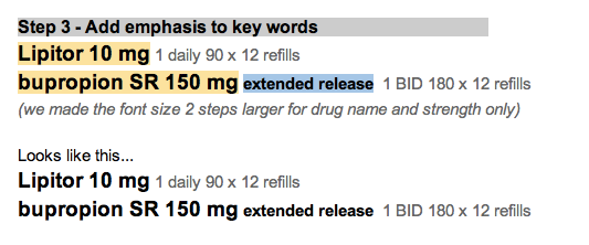
The name should be bold.

... and bigger. It's the name that the eye is scanning for. 

By making it larger and darker, the eye moves there in an instant. 

[footnote 1: more about that at Ware. Visual Thinking for Design]

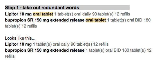
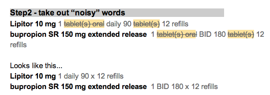
Make the dosage (tablet size) bigger, since it belongs to the name. Leave the Instructions the same size.

In fact, let's subdue the instructions  since that is secondary information, and not what the eye is scanning for. It's a detail for later.

By subduing the instructions with softer gray text, it allows the eye to scan for "the main thing" by reducing visual noise. We like the original Google search page because it eliminated visual noise. 

Now we need to add something that's missing.

A lot of doctors and nurses will just jot down the abbreviation, or the medication bottle label will truncate it God-knows-where.

So,

add the common alternative names

for your region of the world. Keep them subdued though. They are not the main event. Some names are easy to spell, but still hard to pronounce. 

The alternative names should be near the main name, not far to the right, and not competing visually with the main name.

How should the "main name" be chosen?

I think it should be the same as the name on the medication bottle. If we all try (prescribers, pharmacists, nurses, patients and families), we can use the same name all the time to reduce confusion. Use the nicknames when you and your conversation partners choose to. I don't mind using the brand name "Lasix" instead of "furosemide" when it makes conversation easier. We all need to have a shared understanding that "furosemide" will be the "main name" when it's written down on lists and labels.

In the next post, I'll show a short list of 4 medications  and what additional features you need with a simple printed list suitable for your wallet.

  • metformin
  • hydrochlorothiazide
  • lisinopril 
  • metoprolol

Delightful Demo of Medication Reconciliation Prototype

Our colleagues at the University of Maryland Human-Computer Interaction Lab have produced a dramatically effective prototype for medication reconciliation. It is amazingly effective, and gets better with each revision (I'm aware of three versions).

What is medication reconciliation?

That's when a healthcare provider has to compare two versions of your medication list. Say you go see your physician, who gives you a printed copy of your medication list as it was the last time you visited them. Now, you compare it to your personal list (or sack of bottles) of medicine. Do they match? If not, what's missing, what's extra, or what has changed?

If you think that sounds easy, you might think otherwise if you happen to be taking a dozen different medications. It's not that far fetched if you have the big 4 (diabetes, high blood pressure, high cholesterol, and obesity), and then toss in a couple more problems (depression, arthritis, sexual disorders). It's easy to rack up 1-3 medicines per problem.

Watch this short video to see what reconciliation involves. Dr. Catherine Plaisant narrates.


What's the big deal?

When I show this to physicians and nurses who have to do this job manually every day, they are amazed and impressed, and they want it NOW in their own electronic health record software!

Here are some features that make it so effective:

  • Animation: The logic becomes transparent
  • Proximity: Like items merge, unlike items move farther apart
  • Alignment: Columns convey meaning, and condensing adds visual efficiency
  • Color: Meaningfully employed. Green is ready to go, gray is retired to the sidelines.
  • Cognitive effort reduced: Software does the matching, rearranging and condensing, then proposes "near matches" for human adjudication.
  • Highlight differences: The text that doesn't match in two items is highlighted, adding efficiency, accuracy, and safety.

Information Chaos

Researchers at the University of Wisconsin recently published a conceptual article on Information Chaos titled "Information Chaos in Primary Care: Implications for Physician Performance and Patient Safety" (J Am Board Fam Med, Nov-Dec 2011, 24:6, 745-751).

Figure from the article at bit.ly/InfoChaos

I had never heard the concept of "Information Scatter" articulated before, but it resonated strongly with my experience as a family physician using a variety of EMRs over the past decade.

I recently did a post on using Information Dashboards. Think of a dashboard serving the same purpose as the dashboard in your car. It gives you the critical information you need for the task at hand.

  • When you start the car, you get the messages like "time to service your car" or "hey! check your engine".
  • When you are driving, you get speed, fuel status, turn signal indicators, bright light indicators, etc. 
    • You don't have to navigate somewhere else for additional information to do the task of driving.
    • You don't get unnecessary information that is not actionable during the act of driving.

Dashboards are well suited to reducing information scatter, and they help manage information overload when skillfully designed. A key feature that is often overlooked is to pare away all unnecessary data elements (removing words that don't add value).  For example, "lisinopril 10 mg daily", and not "lisinopril 10 mg 1 tablet oral daily".

Why dashboards?

Dashboard views should be the rule rather than the exception in EHR design
Physicians and nurses have to deal with complex data involving a number of realms, making quick judgments based on the overview of the patient's story.


Dashboards beat nested navigation in several ways:
  1. They minimize navigation.
  2. They reduce cognitive load by presenting the needed information in a single view. 
    1. Users don't have to think "What next? Where next? 
    2. Users don't have to use visual memory to recall the last page view: "What was that potassium value I saw seconds ago? Was that drug dose once a day or twice day?"
    3. Users can "scan the scene" to quickly see if there are any abnormals. If the view is "clean", then we can move on.
  3. They accommodate a variety of workflow styles. Methodical  or meandering paths work equally well when only the eye (and not the finger) does the walking. ABCDE sequence is as easy as AEDCB.
  4. They can be customized or personalized to meet unique user needs.
There are some caveats.
  1. Provide only the information needed for the tasks at hand. No more, and no less. That may mean leaving out detail from the grand view, while making that detail available when drilling down.
  2. Use visual cues. They don't have to be words. They do need to be recognizable at a glance. Think icons and traffic lights. 
  3. Try the designs out on real world users.

Medications List - Visual Design Make-over

Attribution

Some rights reserved by CarbonNYC

I'm reading "Designing with the Mind in Mind: Simple Guide to Understanding User Interface Design Rules" by Jeff Johnson. As a typography/layout and design geek, some things are obvious to me, but Jeff Johnson reminds me they are not obvious to everyone. He even makes explicit the cognitive psychology behind the "design rules" that have been gospel to designers.

I'll give his teaching a test drive here, starting with a design from a typical EHR.

Design Make-over - Step by Step

EHR Usability: An Illustrated Guide

I did a brief presentation at NIST on July13, along with about 2 dozen other usability geeks like me. The government recognizes the importance of having usable software if physicians and hospitals are to be expected to adopt electronic medical records. The ARRA incentives alone won't be sufficient if the software usability is lacking, causing physicians and other healthcare workers to lose productivity. They might break even, but many physicians worry that they won't, even with the financial incentives. Here are the pictures. You have to imagine my voice.

View more presentations from Jeff Belden MD.

NIST will be posting the slides and audio later. You might try here.

No Errors from Tall Men

I recently learned about Tall Man lettering.

acetAZOLAMIDE.png

Not to be confused with Mad Men

MadMEN.png

I had been annoyed by the ugliness (the typography snob inside) of drug names like acetAZOLAMIDE instead of acetazolamide. Now I know why the words benefit from being homely.

  • Aiming for patient safety.
  • Helps distinguish drugs that otherwise have similar-looking names.
    • acetAMINPHEN
    • acetAZOLAMIDE

http://www.fda.gov/cder/drug/MedErrors/nameDiff.htmTall Man Lettering of Drugs

Refill alerts on a medication list - help reduce unnecessary work

What if the doctor and patient took care of all the necessary work at a visit for managing chronic disease?

Disclosure: I hate getting calls and faxes for refill requests. It seems totally avoidable. I’m not winning this battle.

It’s fairly common for primary care physician offices to get dozens of phone calls or faxes a week about medication refills.

    It might be about a patient I just saw last week.
  • These calls take time and money: mine and the staff.
  • This is unreimbursed work.
  • I get whiney about it.

If there is a discrepancy between the pharmacy (or patient) request and my records, it gets a lot worse.

Then calls go back and forth, trying to reconcile the difference, and the outcome is not always satisfactory.

So, what can we do about it?

How about adding a little alert to the medication list?

  • Don’t make me think (that is, don’t make me “sort by last refill date”, figure out the interval since last refill, count the meds and remember their names), just show me!
  • Dark red (or gray) could mean “due for refill in <3 months”.
  • Pink (or lighter gray) could mean “due for refill in <6 months”.
  • These intervals (3 and 6 months) match the numbers for “frequency of diabetic lab tests” and “limit on controlled substance refills”.

With this information right in my face, it would be easy to see if, and which, medications need to be refilled today. That avoids an extra call for the patient, an extra fax/call or two for my staff, and a headache for me.

That makes me happy!

(special thanks for the idea to Phil Vinyard at University Physicians Family Medicine Clinics)